library(tidyverse)
costofliving <- readRDS("../datafolder/costofliving2.rds")19 Visualization for descriptive statistics
When doing descriptive statistics, it is very useful to visualize data. This is useful both in the exploratory phase and in the explanatory phase. We return to this in the chapters on visualization. For now, it is useful to just have an overview of some visualization techniques that can be used for descriptive statistics.
The average cost of living in the dataset was at 59. Most cities, in other words, lie quite a bit below New York in cost of living.
mean_cost_of_living <- costofliving %>% summarise(mean = mean(cofi)) %>% pull()

mean_cost_of_living
[1] 58.72749However, we also found that the standard deviation was 21. On average, each city deviates by 21 index points from the average of 59.
sd_cost_of_living <- costofliving %>% summarise(sd = sd(cofi)) %>% pull()

sd_cost_of_living
[1] 20.9556Indeed, the median is a bit higher than the mean, indicating that we have some skewness in the data.
median_cost_of_living <- costofliving %>% summarise(median = median(cofi)) %>% pull()

median_cost_of_living
[1] 64.39Given that the cost-of-living-index varies between 19 and 131, a standard deviation of 21 is quite a lot. What does this look like in practice?
costofliving %>%
  summarise(min = min(cofi),
            max = max(cofi))
# A tibble: 1 × 2
min max
<dbl> <dbl>
1 18.7 131.To see all this in one go, we can make a plot. One of the most common ways of making plots with R is by using the ggplot() function. The chapters on visualization dive more into this function and others. For now we may simply notice that the plot shows the distribution of values of cost-of-living for different cities.
The red line indicates the mean. We see that there are in fact quite a lot of cities that have a higher cost-of-living value than the mean, but since there are some cities with a very high value, and a decent amount of cities with lower values, the mean happens to be somewhat lower. The median reflects, to a larger degree, the bulk of cities that have a higher cost of living. At the same time, we can see how the cities spread out on this variable - there is no super clear tendency for cost of living in the worlds’ various cities.
costofliving %>%
  ggplot(aes(cofi)) +
  geom_histogram() +
  geom_vline(aes(xintercept = mean_cost_of_living), color = "red", size = 1.5) +
  geom_vline(aes(xintercept = median_cost_of_living), color = "blue", size = 1.5) +
  ggtitle("Distibution of cost of living")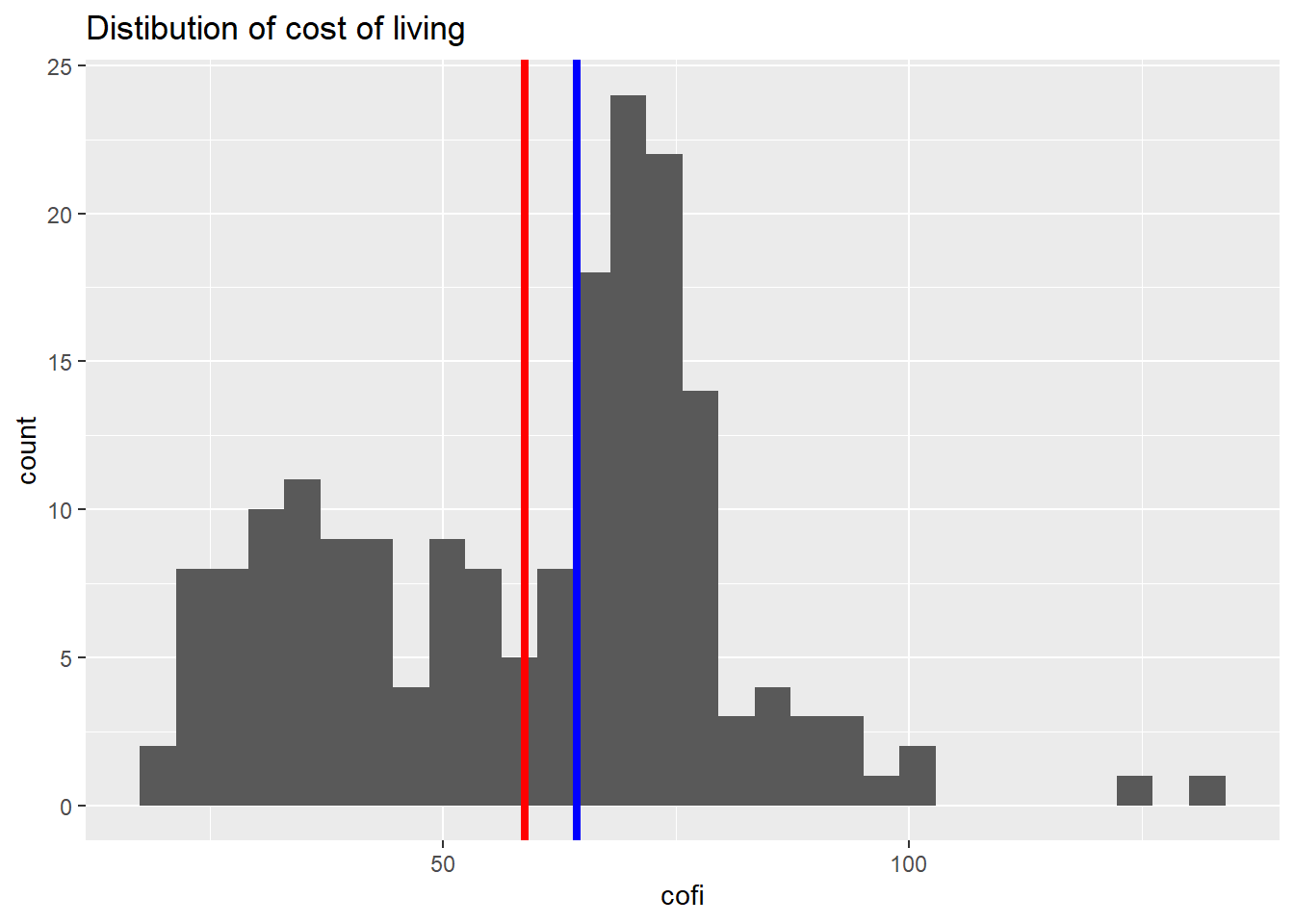
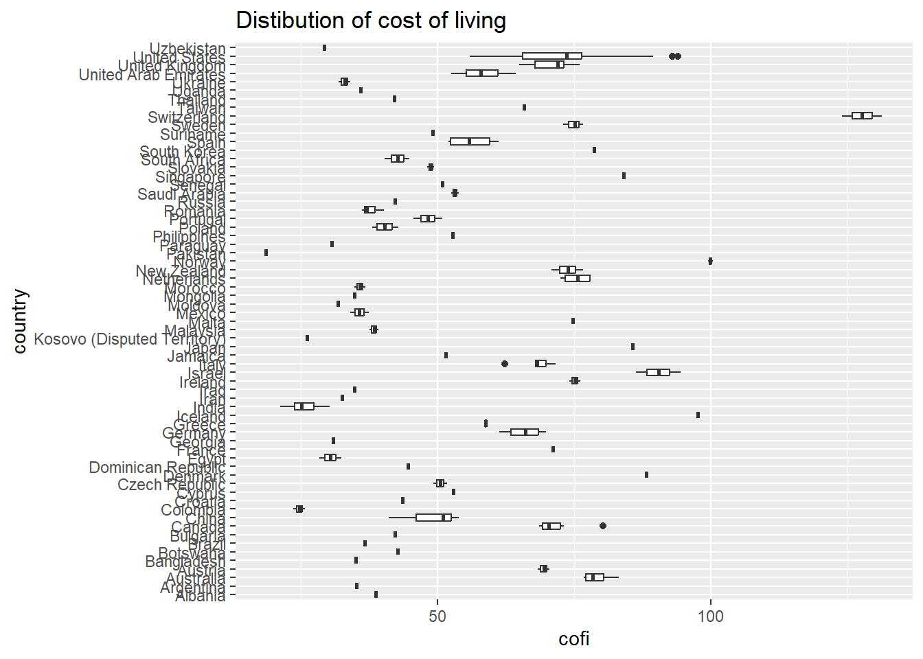
The benefit of visualization in descriptive analysis, then, is that we can easily get an overview of both the central tendency and the spread in the data. There are several other types of plots, and which one to use depends on the relationship we want to show. Another useful plot for this case could for example be boxplots - plots that are good to use whenever we have one categorical variable (for example country) and one continuous variable (cost of living).
costofliving %>%
  ggplot(aes(cofi, country)) +
  geom_boxplot() +
  ggtitle("Distibution of cost of living")