29 Dashboards and Shiny
29.1 Dashboards
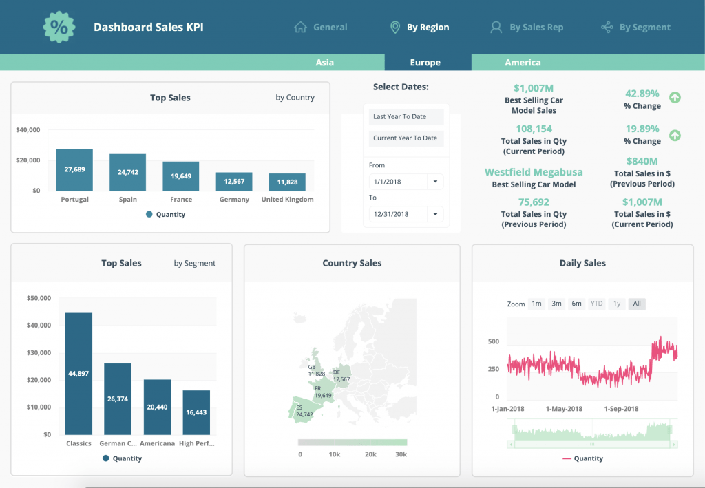
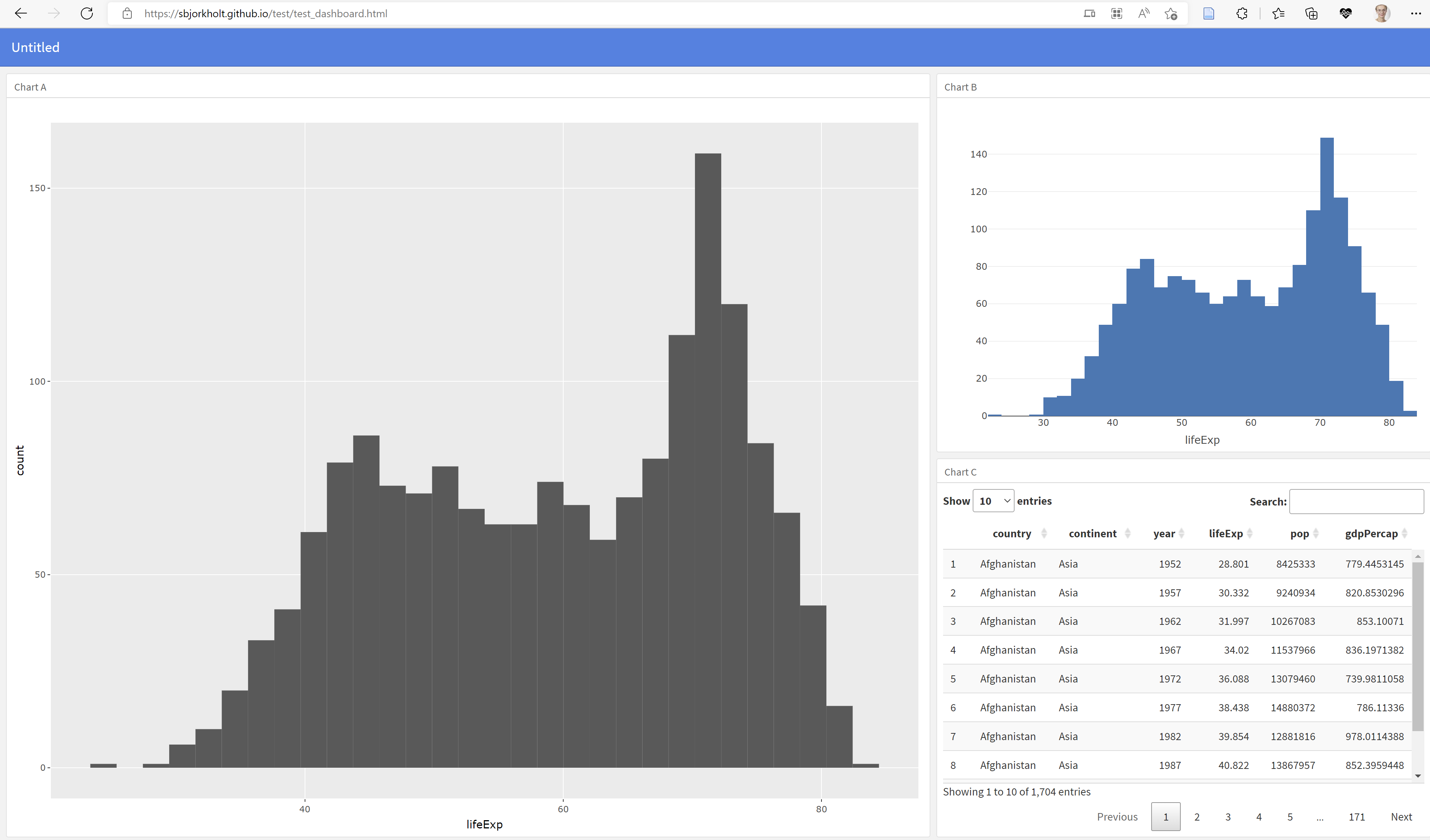
Dashboards are extremely handy to communicate your data. They are basically visual displays of your data. The picture below is an example of a dashboard.
Many data providers today offer a dashboard along with their data to give the user a nice overview of what the data tell us. An example is this dashboard on artificial intelligence from OECD. Some of the great things about dashboards is that they give a quick overview of data, and in contrast to reports, a dashboard can use the most recent data available at all times.
R offers several ways of making dashboards. One more advanced option is to use shiny, a package that allows you to make apps through R. This can be very useful if you want your app to communicate extensively with the user, for example by allowing the user to define certain input and extract other types of output. However, when all we want to do is to visualize some data and allow the user to click around a bit, a simpler solution is often to go for dashboard-creating packages such as flexdashboard. To have a look at this package, refer to for example this page or this page.
To get started with making a dashboard using flexdashboard, we first need to download the package flexdashboard as shown below.
install.packages("flexdashboard")Having done that, create a custom Flexdashboard by doing the following:
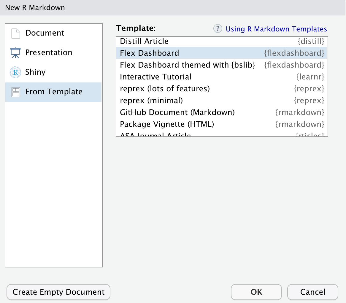
- Click on the “File” button in RStudio to make a new file.
- Quarto is relatively new and support for
flexdashboardis unfortunately not available yet. We need to use the old version for now1, so choose R Markdown. - Then choose “From Template”.
- From the list, pick “Flex Dashboard”.
Now, RStudio opens a new R Markdown file which will render into a dashboard when you click “Knit” (which the the R Markdown word for “Render”).
Flexdashboards are built in what we call a “grid”. That basically means that we can imagine the canvas to have a lot of squares, and we fit stuff into those squares as we go about designing the dashboard. We define the squares through rows and columns. You define a row or a column by specifying either “Column” or “Row” in your script, then optionally the size of the square, followed by a striped line, as shown below.
Column {data-width = 300}
-------------------------------------
Row
-------------------------------------
These are the basic components of the flexdashboard. Building on this, you can do a lot of things, for example:
- Add tabs
- Add navigation bar
- Choose colors, icons, styles
- Include figures, tables, text, links
- Include your own CSS and/or HTML
- Include advanced charts, graphs and maps
- Allow for user-communication through shiny syntax
And much more. For dashboards visualizing real-time data, consider making a dashboard that communicate with an API to fetch the latest data at all times.
For an overview of some of the things that are possible, have a look at this page.
Now you can make your dashboard! To get started, find some inspirational dashboards here.
29.1.1 Deploying a dashboard
Once a dashboard is made, you might want to share it with others. In other words, you want to load the dashboard up to some kind of sever, generate a URL and share your dashboards with others by simply giving them that URL. There are a few ways of doing this - one way is by using Github.
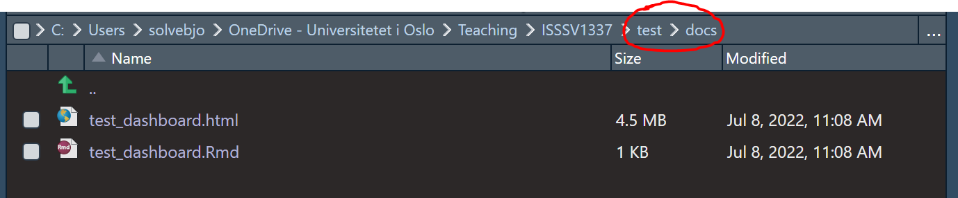
Save the
.Rmdfile to a folder that is connected to a Github repository (that is, a folder you have cloned from Github).Go to the Github repository. Go to “Settings”, in the left menu choose “Pages”, then click on the drop-down menu and choose “main”. The repository needs to be Public for this to work.
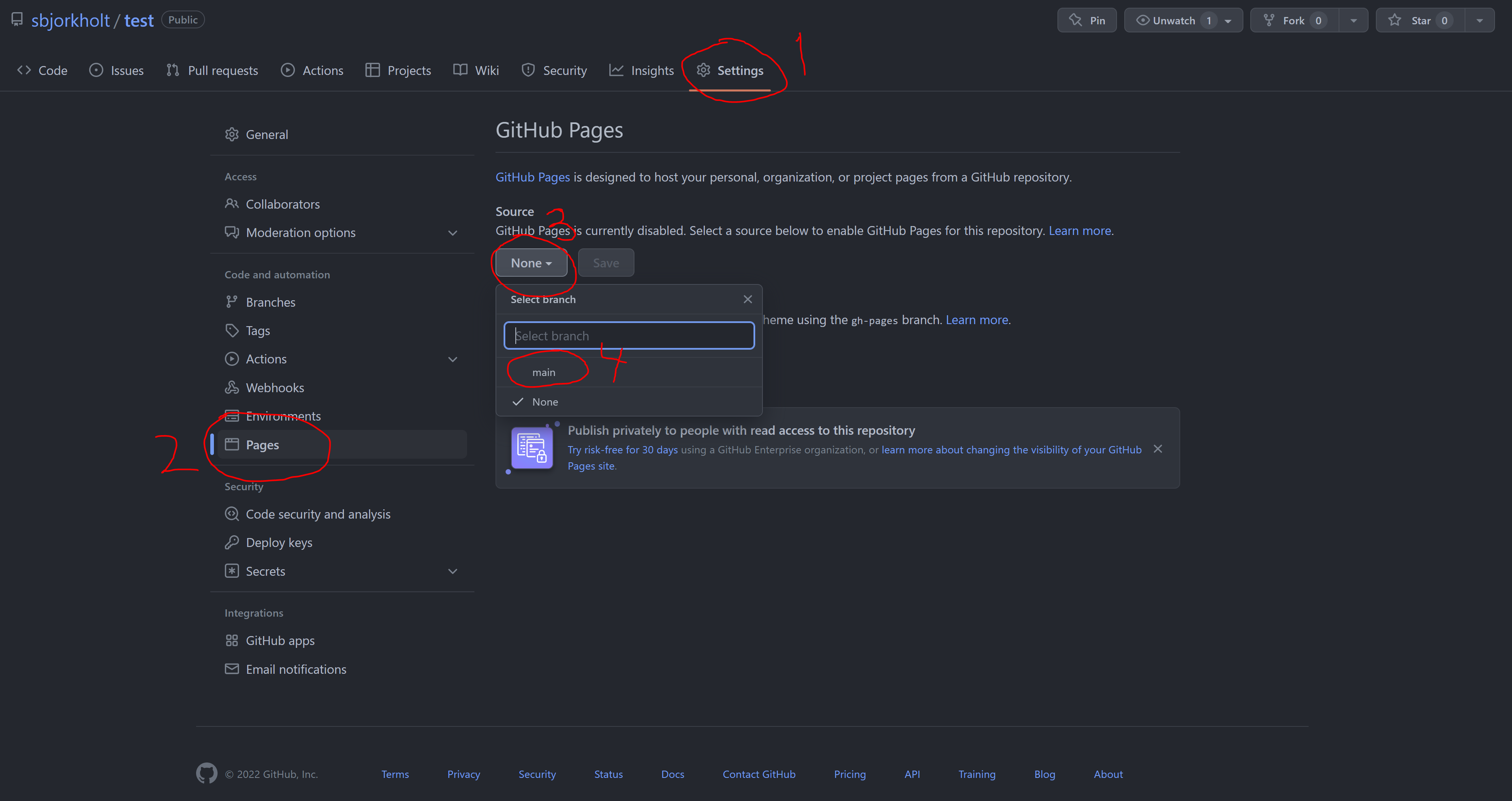
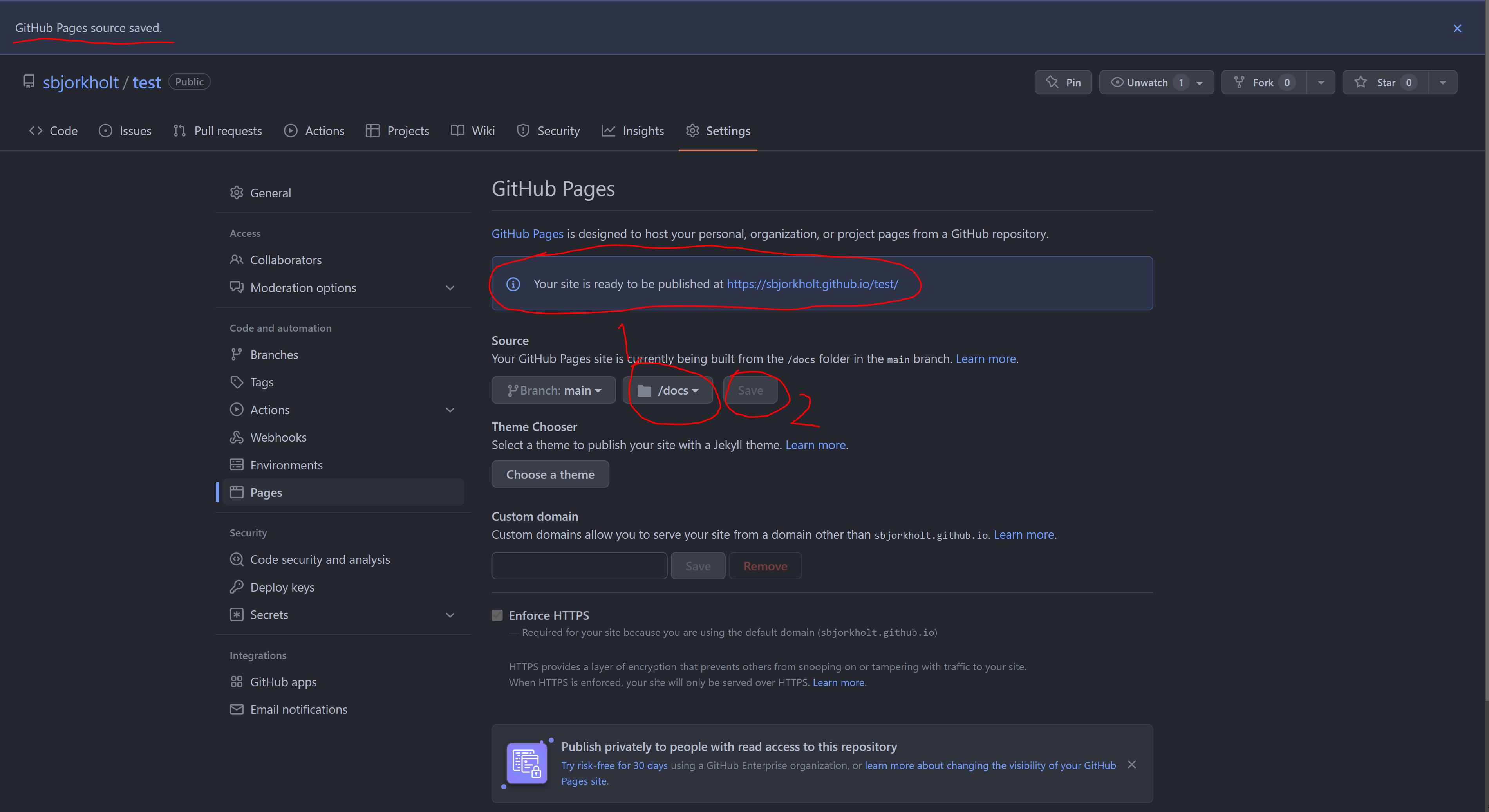
- In the drop-down menu to the right, choose “/docs”2. Then hit the “save” button. You should get information that your site is ready to be published at a specific URL, and that the Github Pages source is saved.
- Now, go back to RStudio (or your folders on your computer). Make a folder called “docs” in the repository-folder, and place your
.Rmdfile in there. Knit the document so that you get two files, one.Rmdfile and one.htmlfile.
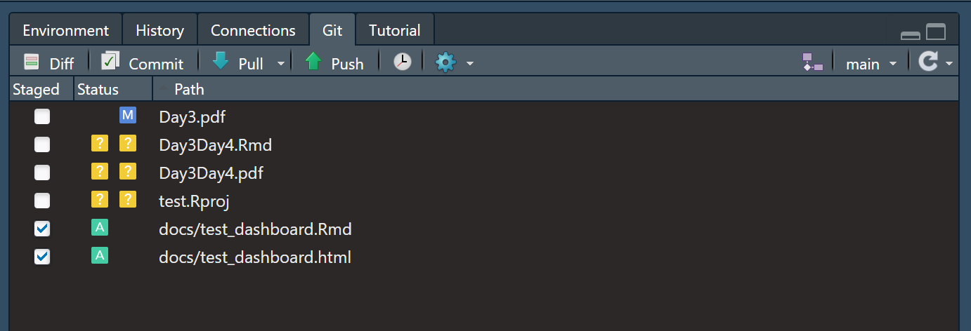
- First,
pullall changes from the Github repository. Then,addandcommityour “docs” folder to the repository, including both your.htmlfile and the.Rmdfile, andpushthe changes. If you just select the “docs” folder in the Git tab in RStudio, you will automatically select all files in this folder.
- Wait some minutes. Write the URL that was shown in stage 3 into your browser and end with /name-of-your-file.html.
- Give others this URL for them to access your dashboard!
29.2 Shiny
Shiny is an R package that allows us to create interactive web applications. With Shiny, we can go a step further than creating dashboards, in that we can interact with the the user of the webpage. If you would like to see an example of how Shiny might work, you can open RStudio and write the following code:
install.packages("shiny")

library(shiny)

runExample("01_hello")
The code to create the app that pops up when running runExample("01_hello") is given below:
# Define UI for app that draws a histogram ----
ui <- fluidPage(

  # App title ----
  titlePanel("Hello Shiny!"),

  # Sidebar layout with input and output definitions ----
  sidebarLayout(

    # Sidebar panel for inputs ----
    sidebarPanel(

      # Input: Slider for the number of bins ----
      sliderInput(inputId = "bins",
                  label = "Number of bins:",
                  min = 1,
                  max = 50,
                  value = 30)

    ),

    # Main panel for displaying outputs ----
    mainPanel(

      # Output: Histogram ----
      plotOutput(outputId = "distPlot")

    )
  )
)

# Define server logic required to draw a histogram ----
server <- function(input, output) {

  # Histogram of the Old Faithful Geyser Data ----
  # with requested number of bins
  # This expression that generates a histogram is wrapped in a call
  # to renderPlot to indicate that:
  #
  # 1. It is "reactive" and therefore should be automatically
  #    re-executed when inputs (input$bins) change
  # 2. Its output type is a plot
  output$distPlot <- renderPlot({

    x    <- faithful$waiting
    bins <- seq(min(x), max(x), length.out = input$bins + 1)

    hist(x, breaks = bins, col = "#007bc2", border = "white",
         xlab = "Waiting time to next eruption (in mins)",
         main = "Histogram of waiting times")

    })

}
This is the basic syntax for all Shiny applications. It consists of two objects, the ui and the server. The ui objects defines all the frontend-stuff, including the figure for how large the bins should be (specified in the sliderInput argument) and which output that is going to show up (given in the plotOutput argument). The server object includes the backend-stuff, in other words where the information about the bin size is taken in and processed to create a plot.
Going further into Shiny is beyond the scope of this book, but if you are interested and would like to try making your own app, I good place to start is here.
R markdown will continue to be supported forward, so there is no danger that what you make will suddenly become outdated and unusable.↩︎
Choosing /docs will publish your dashboard from the docs folder. Choosing /root will publish the dashboard from the main folder. Both work, but it’s often tidier to have the dashboard in a separate folder if your repository also contains other things.↩︎