Graphs are the most effective tools a data scientist can use to communicate their findings. With a graph1, you can quickly create an overview of important findings and draw attention to the most important parts in data. Yet, of course, the effectiveness of the graph depends on the particular graph. There are many bad graphs out there, as the plot on the left below shows you (the so-called “WTF-plot”).
Actually, bad plotting is such a common practice that the R-community has thought they might as well create some fun from it. The R-ladies, for example, host occasional “ugly plot” contests, featuring fabulously ugly plots, such as the one to the right below.
But what is it that makes these plots so bad? Actually, it’s all about information transfer again. Except this time it is not from computer to computer or from computer to human, it is from human to human.
When we communicate results, we want to transfer information on our findings from ourselves to another human being as quickly and smoothly as possible. Since human beings are quite good at processing visual information, we create graphs. However, human beings also struggle when they have to take in a lot of information without understanding the general purpose of the information. We are wired for stories, which is why our ancient ancestors typically communicated knowledge through stories, myths and fables. This ancient wiring is why we want to utilize storytelling to create plots that contribute neatly to our information transfer.
Before we embark on how to create good, understandable plots, we should remember that there is a difference between exploratory and explanatory analysis. Exploratory data analysis (EDA) is what the name suggests – exploration of data. It’s about creating different plots to get an overview. It enables you to see trends, patterns, and outliers. Explanatory analysis, on the other hand, is about using plots to communicate your findings to others. In the exploratory phase, an ugly plot is only a nuisance to yourself. In explanatory analysis, it is much more important that the plot is good enough for others to easily understand what you are trying to communicate.
Exploratory data analysis (EDA) is often done by simply making a lot of different plots. We will learn how to do that later. However, it is worth noting that R also has different packages you can use for exploratory data analysis, for example DataExplorer, GGally, SmartEDA and tableone. Below is an example with the package GGally using the dataset gapminder, which contains data on life expectancy (lifeExp), population size (pop) and GDP per capita (gdpPercap) for different countries and continents over several years. The package compares different variables over two values – in this case it compares countries in Europe and Asia.
For these plots, we can for example see that life expectancy in Asian countries is lower than in European countries, and that GDP per capita is higher in European countries (except for one Asian outlier). Population size is slightly higher in Asia, and especially so for two outliers.
library(GGally)

options(scipen=999) # To get full numbers instead of scientific numbers

gapminder <- gapminder::gapminder %>%  # Loading the dataset "gapminder" from the package "gapminder". The notation :: means "use function from package".
  filter(continent %in% c("Asia", "Europe")) %>% # Picking the values "Asia" and "Europe" from the variable "continent"
  group_by(continent, country) %>% # Group after continent and country to aggregate
  summarise(lifeExp = sum(lifeExp, na.rm = TRUE), # Aggregate to sum using "summarise", getting the sum of lifeExp, pop and gdpPercap for all years
            pop = sum(pop, na.rm = TRUE),
            gdpPercap = sum(gdpPercap, na.rm = TRUE)) %>%
  ungroup() %>% # Ungrouping from continent and country
  select(continent, lifeExp, pop, gdpPercap) # Creating dataframe with only the variables continent, lifeExp, pop and gdpPercap

gapminder %>%
  ggpairs(mapping = aes(color = continent, alpha = 0.5)) +
  theme(axis.text.x = element_text(angle = 60, hjust = 1))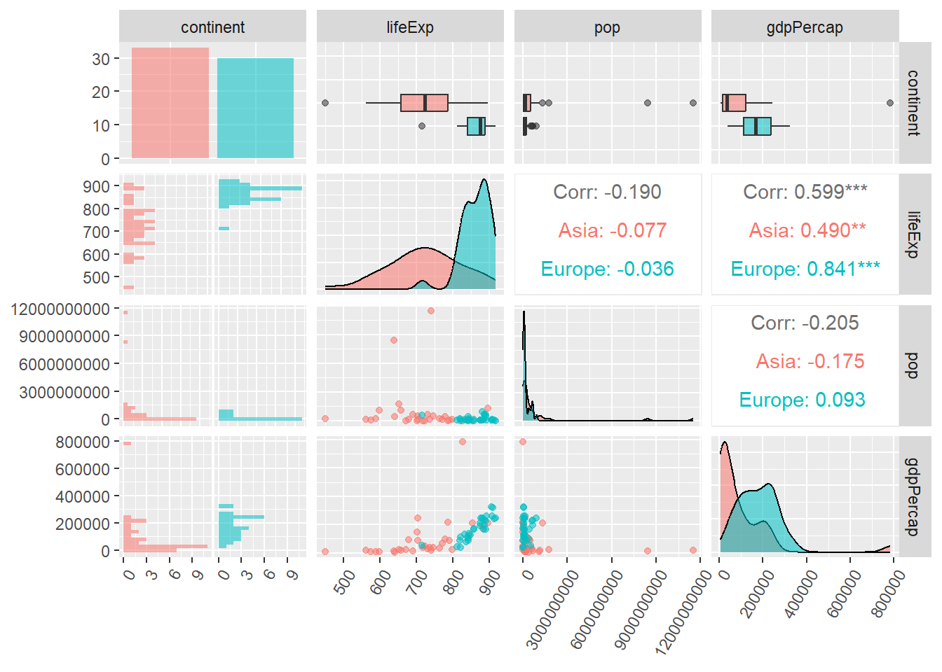
In explanatory visualization, you want to communicate your findings. In this case, it is important to be aware of three things:
The rest of this document will be focused on the “how” part. The figure below is taken from the book Storytelling with data, which offers a good introduction on when to use the different types of graphs.
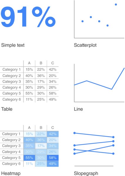
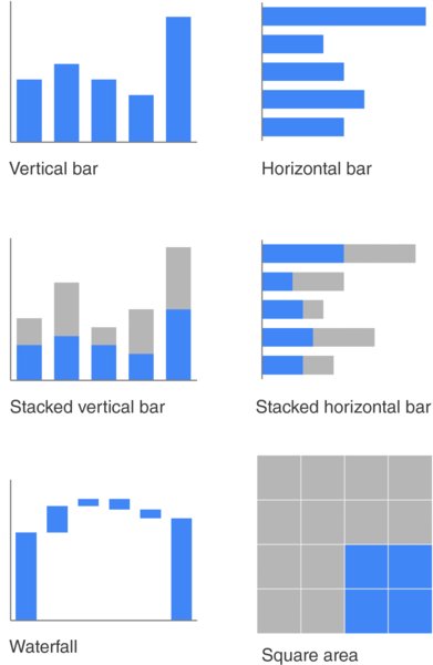
We’ll be looking at how to make some of these plots in R. A useful thumb of rule to begin with, is to note which variables you need to use in order to communicate your results. Once you know which variables need, you can pick a plot based on the variable types. Recall that categorical variables have values that differ from each other but cannot be ranked (e.g. “blue” and “red”), while continuous variables can be ranked (e.g. 1, 2, 3, 4, 5…). Here is a small overview on how we can pick plots based on variable types:
ggplot2ggplot2 is the go-to package to work with plots in R2. You can create almost any plot with this package, from the most simple ones to very advanced plots.
ggplot philosophyThe basic idea of ggplot is that a plot is a series of layers that you put on top of each other. Imagine it like an empty canvas, and like a painter, you add layer upon layer until you have a complete graph. In particular, ggplot needs three layers to give us something functional. Below, we will show how this might look using the dataset gapminder again.
Layer 1 The first layer is the empty canvas. It looks like a blank slate where anything can be drawn, but it is confined to the data you want to use. In other words, in the first layer, you decide which data you want. You initiate this by calling ggplot() on the name of the dataset you are using.
library(ggplot2)

gapminder::gapminder %>%
  ggplot()
Layer 2 In the second layer, we need to tell ggplot which variables from the dataset we want to plot. We use the function aes() inside the ggplot() function to do this. Here, we tell ggplot to plot the variable “lifeExp”. Notice how the variable has become present on the X-axis of the plot.
gapminder::gapminder %>%
  ggplot(aes(lifeExp))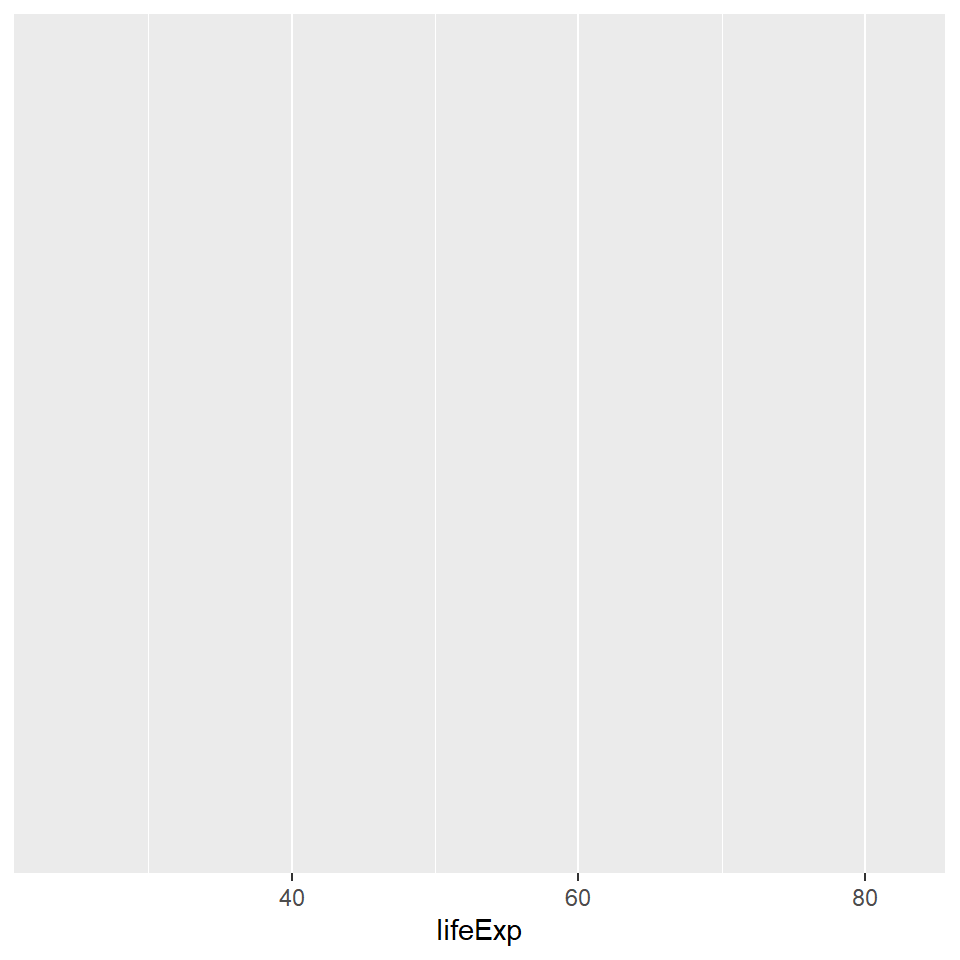
Layer 3 In the last layer, need to tell ggplot which type of plot we want. These are specified using the geom_ function. For example, if we want a histogram, we write geom_histogram. We’ll learn a few other plot types below.
gapminder::gapminder %>%
  ggplot(aes(lifeExp)) +
  geom_histogram()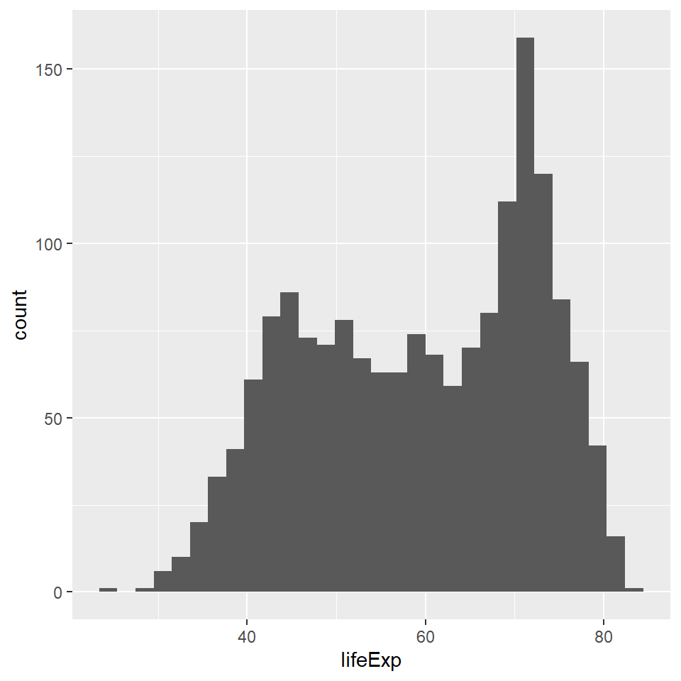
Now we have a fully functional plot! This plot tells us the life expectancy for different countries over different years. More technically, it shows us how many times different values on the “lifeExp” variable occur in the dataset. The most common life expectancy for countries in the world between the years 1952 and 2007 appears to be about 70 years.
To recap, here are the three basic commands and functions for ggplot:
| Layer | Command | Function |
|---|---|---|
| Layer 1 | Initiate the plot, decide the data | ggplot() |
| Layer 2 | Add the variables | aes() |
| Layer 3 | Decide on the plot type | geom() |
In this section, I present the basic build for some different plot types, and then show some ways to modify the plots to make them look better.
Let’s look at other types of plot. And to do this, we’ll use data from Eurostat. As we learned yesterday, Eurostat has an API we can use to gather data. Using this API, we download two datasets on European countries over different industries and years; one dataset on greenhouse gas emissions and one dataset on money spent on research and development (R&D).
What is the relationship between R&D-spending and greenhouse gas emission for different countries, for different industries, and over time?
Below follows some repetition on the use of API, data processing and joining.
library(eurostat)

green <- get_eurostat("env_ac_ainah_r2", # The dataset "Air emissions accounts by NACE Rev. 2 activity"
                      filters = list(airpol = c("GHG", "CO2"), # Which air pollutant do we want? Picking the category "Greenhouse gases (GHG)" and "CO2"
                                     nace_r2 = c("A", "B", "C", "D_E", "F", "G", "H", "I", "J", "K", "L68", "M_N", "O_P", "Q", "R", "S-U", "TOTAL"), # Which industries do we want? Picking industries from category A to U.
                                     unit = "G_HAB", # Which measure do we want? Picking "Grams per capita (G_HAB)"
                                     time = c("2010", "2011", "2012", "2013", "2014", "2015", "2016", "2017", "2018", "2019", "2020"))) # Picking data for 10 years, 2010 to 2020.

green <- green %>% # Data is processed to merge.
  pivot_wider(names_from = "airpol", values_from = "values") %>% # Pivoting (spreading) the categories "GHG" and "CO2" on the "airpol" variable into two different columns
  select(-c(unit)) %>% # Removing the columns "unit" since we do not need it anymore, and they do not exist in the other dataset, so cannot be merged.
  mutate(time = str_extract(time, "[0-9]{4}"), # Taking out the part of the string that has four numbers in a row, i.e. the year.
         time = as.numeric(time)) # Converting the year to numeric, since processing is often quicker then.

research <- get_eurostat("rd_e_berdindr2", # The dataset "BERD by NACE Rev. 2 activity"
                         filters = list(nace_r2 = c("A", "B", "C", "D_E", "F", "G", "H", "I", "J", "K", "L68", "M_N", "O_P", "Q", "R", "S-U", "TOTAL"), # Which industries do we want? Picking industries from category A to U.
                                        unit = "EUR_HAB", # Which measure do we want? Picking "Euro per inhabitant (EUR_HAB)"
                                        time = c("2010", "2011", "2012", "2013", "2014", "2015", "2016", "2017", "2018", "2019", "2020"))) # Picking data for 10 years, 2010 to 2020.

research <- research %>% # Data is processed for merge -- same procedure as above.
  rename(rnd = values) %>%
  select(-unit) %>%
  mutate(time = str_extract(time, "[0-9]{4}"),
         time = as.numeric(time))

green_research <- left_join(green, research, by = c("geo", "time", "nace_r2"))

green_research <- green_research %>%
  select(geo, time, nace_r2, GHG, CO2, rnd) %>% # This is just to get the columns in a nicer order
  rename(industry = nace_r2) %>% # Renaming the column on industry type to something more intuitive
  mutate(industry = recode(industry,
                           "A" = "Agriculture, Forestry and Fishing",
                           "B" = "Mining and Quarrying",
                           "C" = "Manufacturing",
                           "D_E" = "Electricity and Water supply",
                           "F" = "Construction",
                           "G" = "Wholesale and Retail Trade",
                           "H" = "Transportation and Storage",
                           "I" = "Accommodation and Food Service Activities",
                           "J" = "Information and Communication",
                           "K" = "Financial and Insurance Activities",
                           "L68" = "Real estate",
                           "M_N" = "Professional, Scientific, Technical and Administrative",
                           "O_P" = "Public Administration, Defence and Education",
                           "Q" = "Human Health and Social Work Activities",
                           "R" = "Arts, Entertainment and Recreation",
                           "S-U" = "Others, incl. household"))

green_research %>%
  head() # Showing the first six rows of the data
# A tibble: 6 × 6
geo time industry GHG CO2 rnd
<chr> <dbl> <chr> <dbl> <dbl> <dbl>
1 EU27_2020 2010 TOTAL 7962454. 6408226. 304.
2 EU27_2020 2011 TOTAL 7850618. 6308211. 328.
3 EU27_2020 2012 TOTAL 7683787. 6151509. 341.
4 EU27_2020 2013 TOTAL 7435418. 5916355. 350.
5 EU27_2020 2014 TOTAL 7172868. 5659364. 360.
6 EU27_2020 2015 TOTAL 7253294. 5755115. 377 Bar plots work well if the main thing you want to come across to the audience has to do with categorical variables. We have already been introduced to geom_histogram, which is a type of bar plot that is ideal if you have only one variable where it makes sense to count the occurrences of values on that variable.
To plot two variables against each other in a bar plot, we use geom_bar(). We could for example look at how emission of greenhouse gas varies between countries. However, plotting only:
green_research %>%
  ggplot(aes(geo, GHG)) +
  geom_bar()
would yield an error message saying “stat_count() can only have an x or y aesthetic.” This is because geom_bar tries to count the occurrences of variable, but now there are two variables in the code. Which to count?? The solution is to add stat = "identity" inside geom_bar(). Now, ggplot knows that it should plot the first variable on the X-axis and the second variable on the y-axis. This gives us the distribution of greenhouse gas emission by country for all years for all industries.
green_research %>%
  ggplot(aes(geo, GHG)) +
  geom_bar(stat = "identity")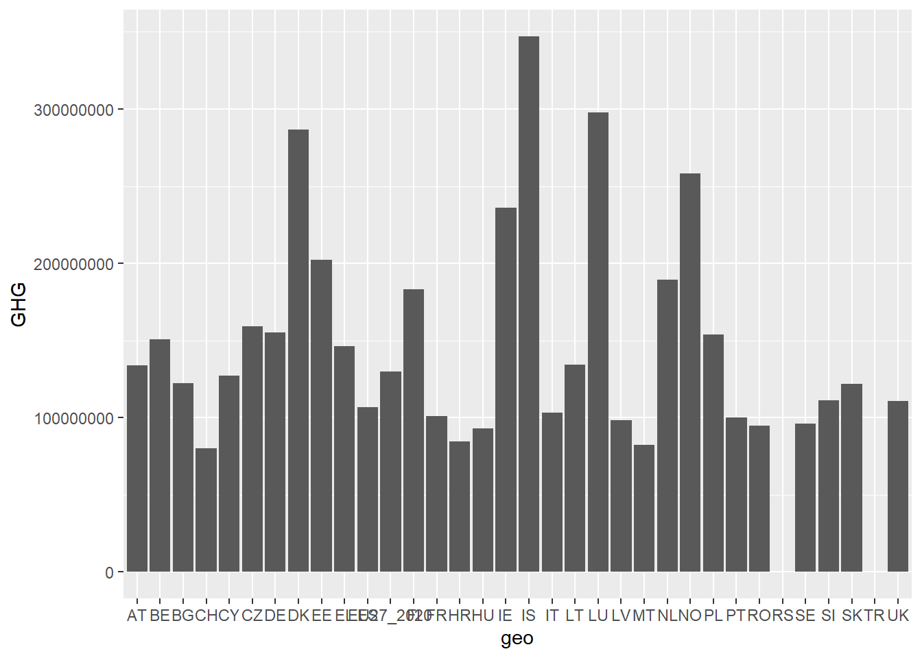
The above plot is bundled up in a way that makes it difficult to interpret. Adding together all years and industries without showing them in the plot, clouds the results.
Here, I show three different solutions to this, including some plot customization.
filter to get only one year and one industry category. Let’s look at the industry category “TOTAL” (which means we get the complete greenhouse gas emissions for all industries) for the year 2018. In this plot, we also use fct_reorder to get the bars in a more readable order, and coord_flip to flip the plot around, making the names of the countries more readable.green_research %>%
filter(time == 2018) %>% # Picking the year 2018
filter(industry == "TOTAL") %>% # Picking the category "TOTAL"
filter(!geo %in% c("TR", "RS")) %>% # Removing countries with no values
ggplot(aes(fct_reorder(geo, GHG), GHG)) + # Using fct_reorder to change the order to the bars so that the biggest one comes first
geom_bar(stat = "identity") +
coord_flip() # Flipping the plot to get the X-axis on the Y-axis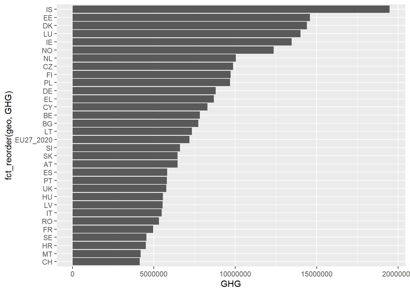
filter out the industry category “TOTAL”, and then we use group_by and summarise to find the total sum of greenhouse gas emissions from 2010 to 2020 grouped by country.aggregate_emission <- green_research %>%
filter(industry == "TOTAL") %>% # Picking the industry category "TOTAL"
group_by(geo) %>% # Find aggregates grouped by the geo variable (i.e. countries)
summarise(total_emission = sum(GHG, na.rm = TRUE)) # Aggregate up total emissions using sum(), also specifying na.rm = TRUE to look past missing values
aggregate_emission %>%
head() # Showing the first six rows of the new dataset# A tibble: 6 × 2
geo total_emission
<chr> <dbl>
1 AT 74485139.
2 BE 87478409.
3 BG 84754271.
4 CH 44345741.
5 CY 89634740.
6 CZ 109624427.aggregate_emission %>%
filter(!geo %in% c("TR", "RS")) %>%
ggplot(aes(fct_reorder(geo, total_emission), total_emission)) +
geom_bar(stat = "identity") +
coord_flip() 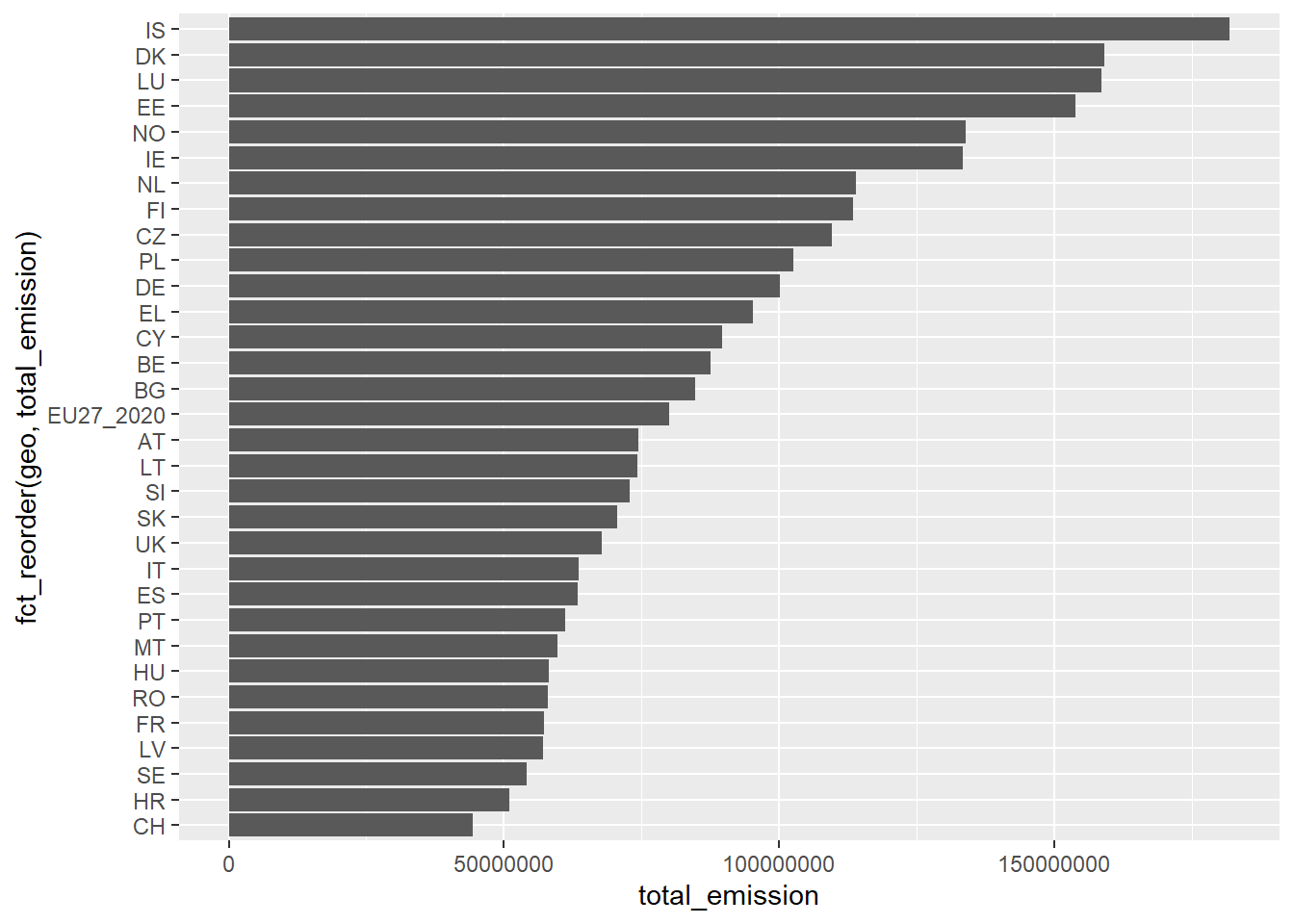
fill argument. This argument alone would create a stacked bar plot. To get the bars next to each other, add the argument position = "dodge" inside geom_bar() This way, we get bars of a different category beside each other for each category. This quickly creates a ton of bars, so in the plot below, I choose to filter out only Germany (DE), the United Kingdom (UK) and France (FR). Now we get the greenhouse gas emission per industry per country for 2018.green_research %>%
filter(time == 2018) %>% # Picking the year 2018 again
filter(industry != "TOTAL") %>% # Removing the category "TOTAL"
filter(geo %in% c("DE", "FR", "UK")) %>% # Picking the countries DE, FR and UK
ggplot(aes(geo, GHG, fill = industry)) + # fill = industry adds a third variable to the plot -- industry
geom_bar(stat = "identity", position = "dodge") + # position = "dodge" places the bars next to each other
coord_flip() 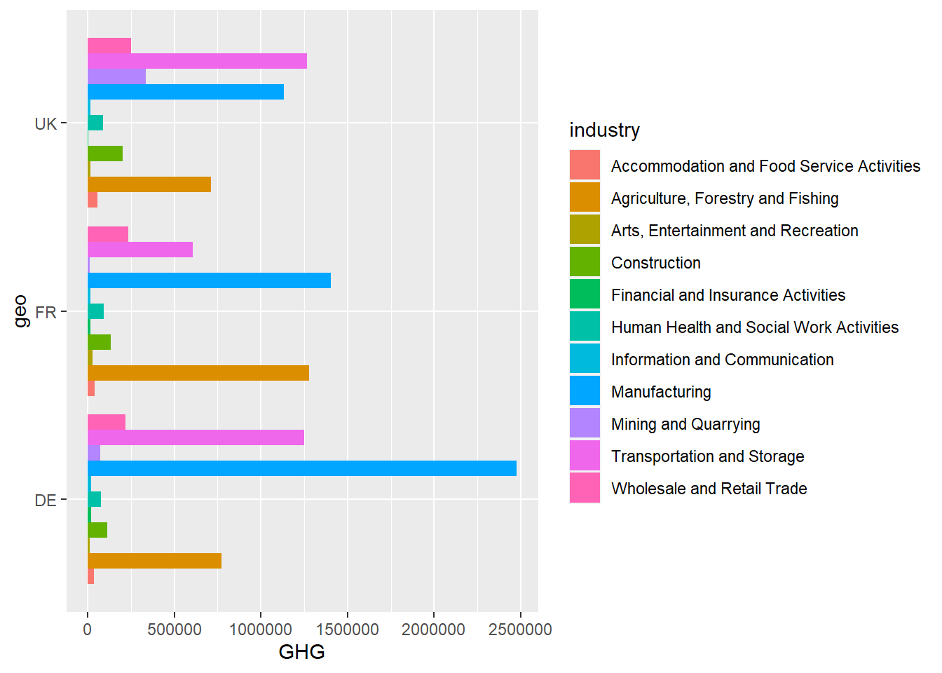
Scatterplots work excellently if the main thing you want to show is the relationship between two or more continuous variables. To make a scatterplot, you add the argument geom_point. For example, we can look at the relationship between greenhouse gas emissions and effort on research and development.
green_research %>%
  ggplot(aes(GHG, rnd)) +
  geom_point()
Looks like there’s a slight positive relationship between greenhouse gas emission and R&D-spending. Could it be that the more emission an industry has, the more it also spends on R&D? Let’s add a trend-line to the graph to see the relationship clearer. This, we do by simply adding geom_smooth as an extra layer to the plot. I also filter away the “TOTAL” category on the “industry” variable, because it does not make sense to compare the total emission of industries to individual categories of industries.
green_research %>%
  filter(industry != "TOTAL") %>% # Removing the "TOTAL" category
  ggplot(aes(GHG, rnd)) +
  geom_point() +
  geom_smooth() # Adding a trend-line to the data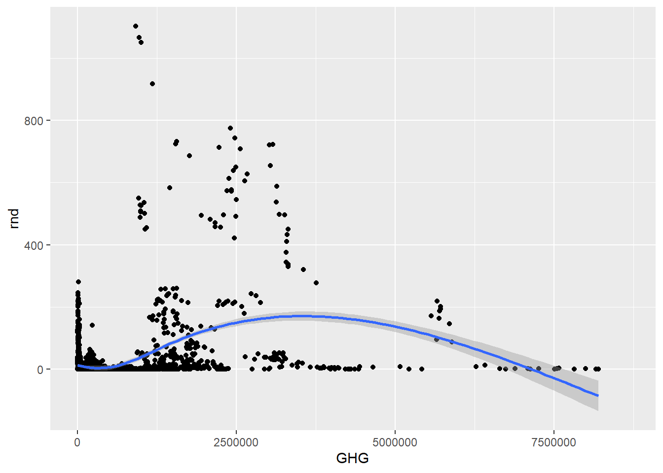
Looks like there’s a lot of variation among the different industry categories. To make this clearer, we can add another variable to the plot by coloring the dots after which category they belong to. We can for example color them after industry category. To do this, add color to the aes() argument, and specify which variable you want (should ideally be a categorical variable). We can also change the trend-line to become linear by adding the argument method = "lm" inside geom_smooth(). Doing this while also having the color argument will create one trend-line for each category.
green_research %>%
  filter(industry != "TOTAL") %>%
  ggplot(aes(GHG, rnd, color = industry)) + # Coloring the dots using color = industry
  geom_point() +
  geom_smooth(method = "lm") # Making the trend-line linear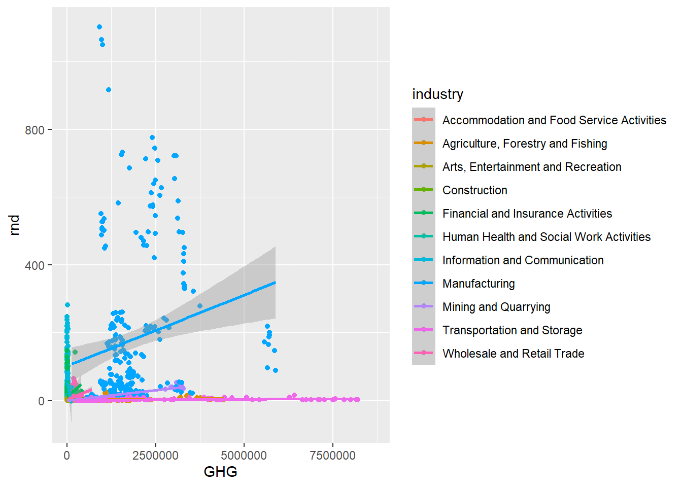
Looks like the manufacturing-industries spend more on research and development than companies within transportation and storage, despite both polluting quite a lot compared to the other industry categories. However, is this dependent on which type of pollution we’re talking about? We can look at this by adding a fourth variable to the plot. Scatterplots can be converted into bubbleplots by specifying the size argument, and this way, they can actually show the relationship between three continuous variables and one categorical! Below, I also use the argument alpha to make the bubbles more transparent – the lower the value, the more transparent.
green_research %>%
  filter(industry != "TOTAL") %>%
  ggplot(aes(GHG, rnd, color = industry, size = CO2)) + # Setting the size of the bubbles to CO2-emission
  geom_point(alpha = 0.3) + # alpha allows us to make the dots (bubbles) more transparent
  geom_smooth(method = "lm", size = 1) # Setting the size of the trend-line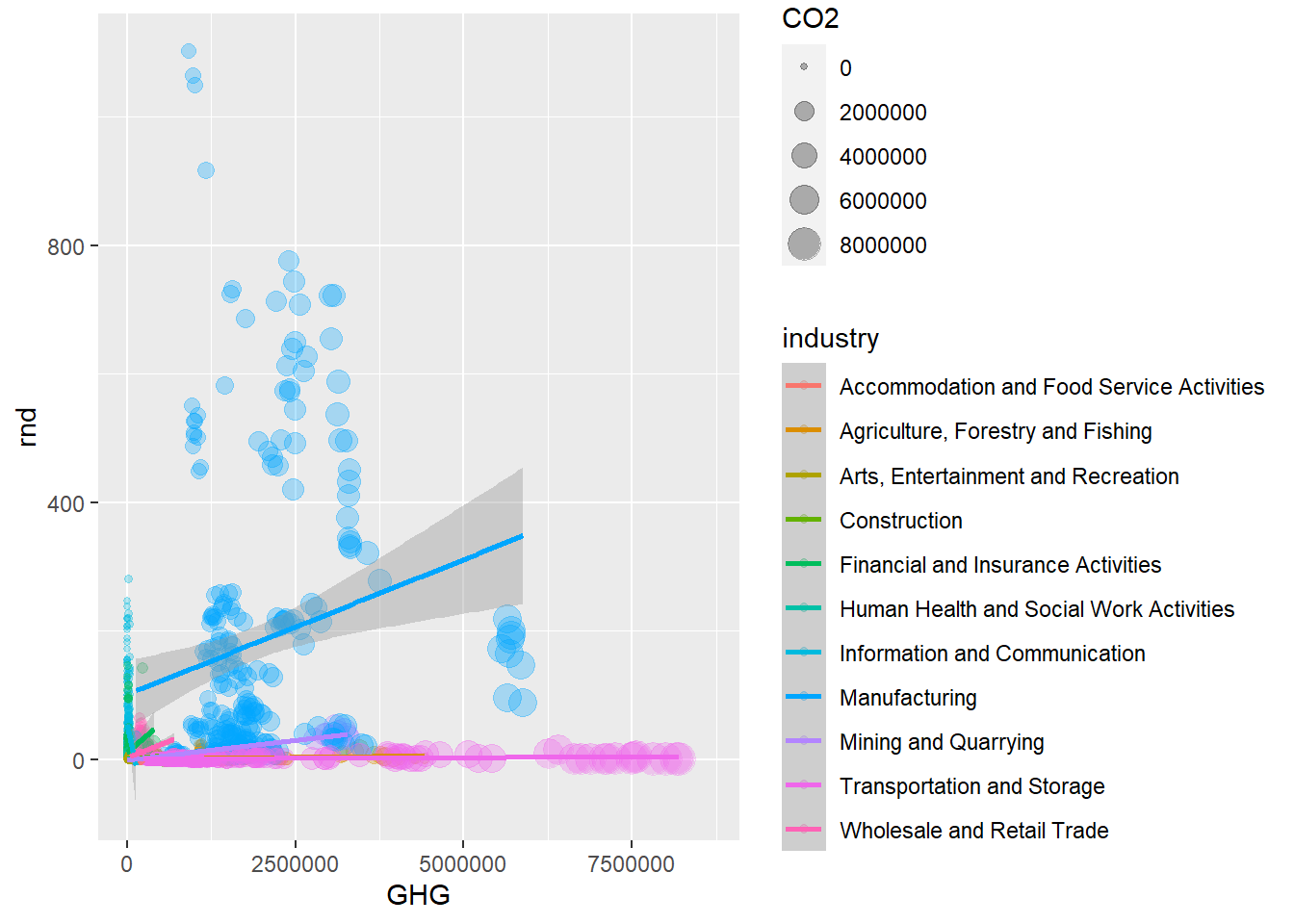
Want an even more exhausting plot? Let me tell you that we can add another categorical variable, making our plot show the relationship between three continuous variables and two categorical ones. We add another layer, geom_label to convert the dots (or bubbles) into labels. Then, using aes() again since we are calling a variable, we specify label. To get complete information, I use mutate to create new variable called “countryyear”, where I paste together values from the variable “geo” and “time”. This is the variable I add to the label argument.
green_research %>%
  mutate(countryyear = paste(geo, time)) %>% # Making a new variable composed of the strings from geo and time
  filter(industry != "TOTAL") %>%
  ggplot(aes(GHG, rnd, color = industry, size = CO2)) +
  geom_point(alpha = 0.5) +
  geom_label(aes(label = countryyear)) + # Makes the dots into labels, and fills the labels with values from the "countryyear" variable
  geom_smooth(method = "lm", size = 1) # Setting the size of the trend-line to 1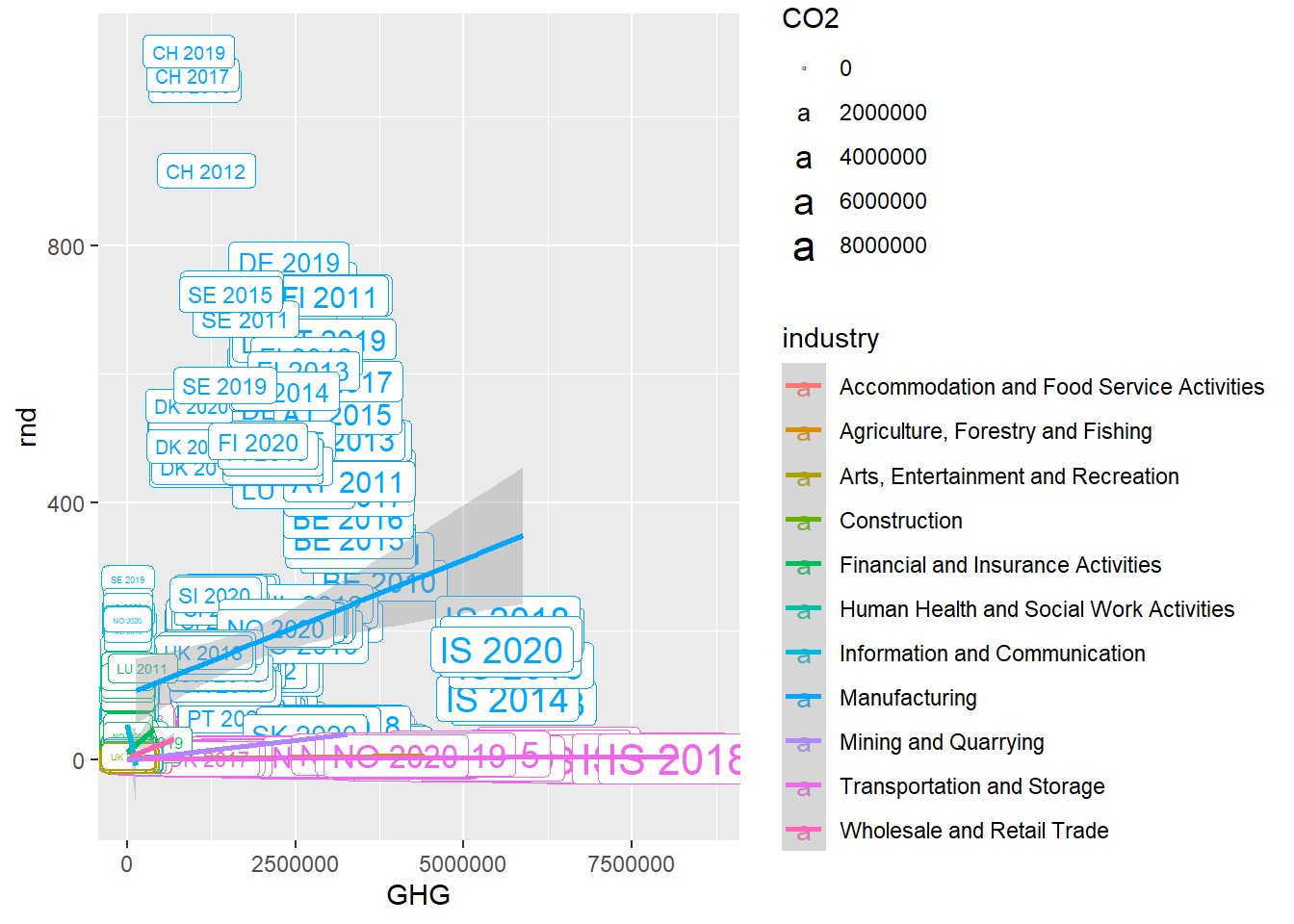
If you think this plot has a bit too much information already, you’re probably right. Cognitive overload indeed.
Line plots are good for showing variation over time. They can be a bit tricky to get working because they do an aggregation within the plot functionality. However, the basic concepts are using geom_line and specifying how many lines you want with the group argument. In the example below, I also had to filter out the “TOTAL” category, because the lines cannot handle multiple categories for each line.
green_research %>%
  filter(industry == "TOTAL") %>% # Picking the "TOTAL" category
  ggplot(aes(time, GHG, group = geo)) +  # Grouping by geo, i.e. getting one line per country
  geom_line() # Making a line plot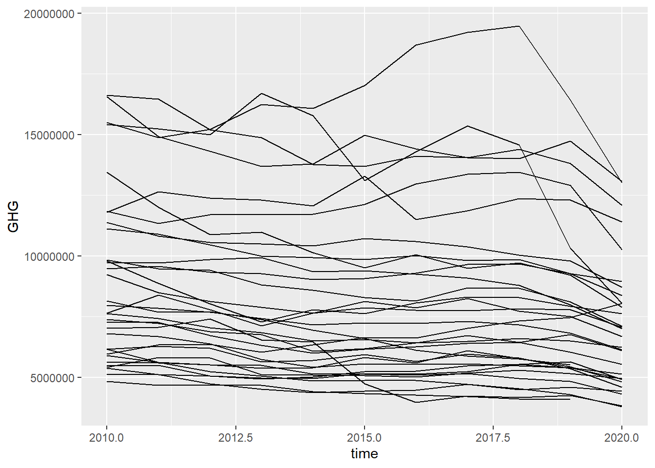
To know which line that belong to which country, we can also specify the color argument. Here, I also convert the “time” variable into a factor by using mutate and as_factor. This removes the decimals from the year-values on the x-axis.
green_research %>%
  mutate(time = as_factor(time)) %>% # Making the variable into a factor, removing decimals
  filter(industry == "TOTAL") %>%
  ggplot(aes(time, GHG, group = geo, color = geo)) + # Coloring the lines after country
  geom_line()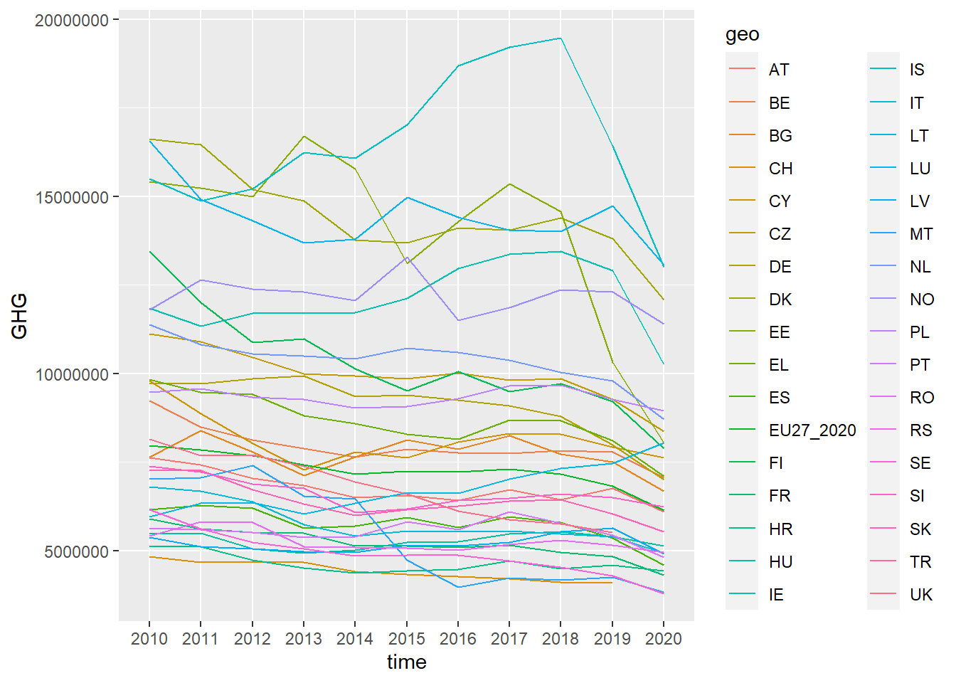
Line graphs have a tendency to become rather crowded. They turn into “spagetthi-grams” as they say. One common solution to this is to filter out just some countries.
green_research %>%
  mutate(time = as_factor(time)) %>% # Making the variable into a factor, removing decimals
  filter(geo %in% c("DE", "FR", "UK")) %>% # Filtering out some countries
  filter(industry == "TOTAL") %>%
  ggplot(aes(time, GHG, group = geo, color = geo)) + # Coloring the lines after country
  geom_line(size = 1.5) # Setting the size of the line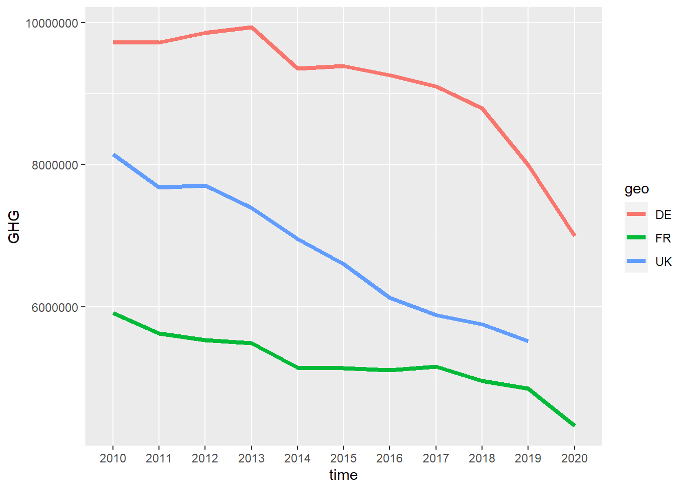
Want to show the relationship between one categorical and one continous variable? Then a boxplot might be ideal. It also shows outliers and medians, so it can be quite handy. In a boxplot, the line in the middle is the median, the white box is the 1st quantile and the 3rd quantile, the lines show the range of the data, and the dots are outliers. To get a boxplot, use geom_boxplot.
green_research %>%
  ggplot(aes(geo, GHG)) +
  geom_boxplot()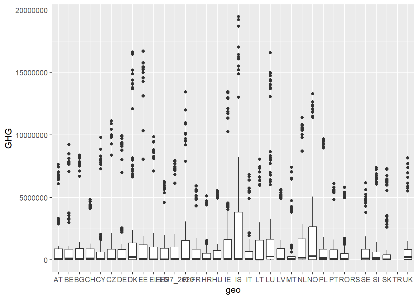
Boxplots can take some of the same arguments that we have already seen, for example coord_flip to get the x-axis along the y-axis, and geom_label with the argument label inside aes to form the dots after a label in the dataset.
green_research %>%
  ggplot(aes(geo, GHG)) +
  geom_boxplot() +
  geom_label(aes(label = time)) +
  coord_flip()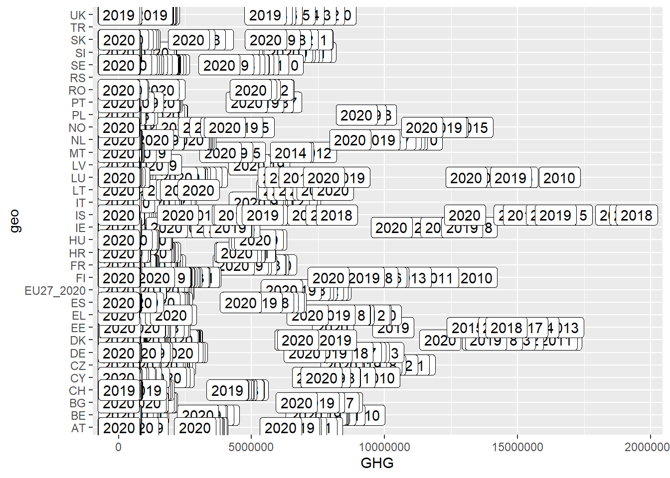
Once you know which plot you want to make, you can start customizing it by creating titles, adding labels to the axes, choosing optimal colors, nice background, moving the legends around, and so on. These functions can be used for any plot.
You can add titles and lables to your plot. To do this, we use labs with the argument x to specify the x-axis and y to specify the y-axis. ggtitle allows us to add a title to the plot.
green_research %>%
  filter(time == 2018) %>%
  filter(industry != "TOTAL") %>%
  filter(geo %in% c("DE", "FR", "UK")) %>%
  ggplot(aes(geo, GHG, fill = industry)) +
  geom_bar(stat = "identity", position = "dodge") +
  coord_flip() +
  labs(x = "Country", # Here we add names on the x-axis
       y = "Greenhouse gas emission") + # Here we add names on the y-axis
  ggtitle("Greenhouse gas emission in large European countries per industry, 2018") # Here we add a plot title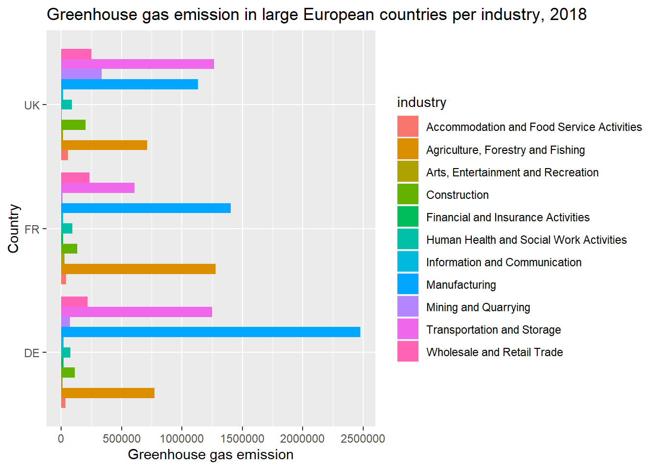
Not happy with the slightly grey, square shaped background in the plot? ggplot has a number of different backgrounds we can choose, for example theme_bw, theme_minimal and theme_dark. For a list of some themes, you can refer to this link.
green_research %>%
  filter(time == 2018) %>%
  filter(industry != "TOTAL") %>%
  filter(geo %in% c("DE", "FR", "UK")) %>%
  ggplot(aes(geo, GHG, fill = industry)) +
  geom_bar(stat = "identity", position = "dodge") +
  coord_flip() +
  labs(x = "Country",
       y = "Greenhouse gas emission") +
  ggtitle("Greenhouse gas emission in large European countries per industry, 2018") +
  theme_bw() # We add another layer specifyinf which background we want for the plot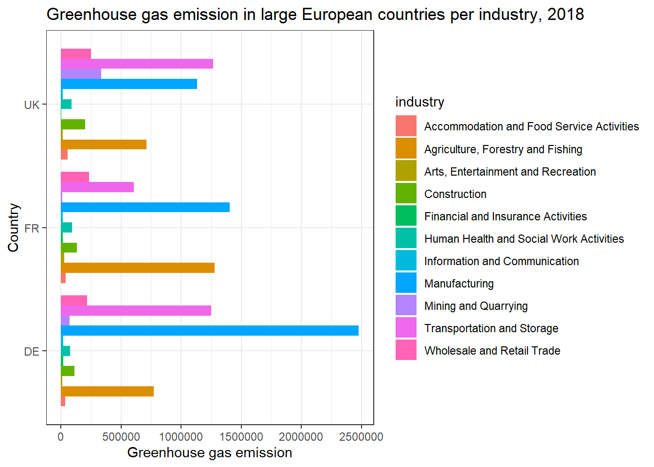
The categories on the side are called legends. Whenever you use fill or color or size, or any other function in ggplot that divides the plot by some sort of category, you are going to get a legend.
In this plot, the legend shows which color on the bars that belongs to which category on the industry-variable. Legends can be modified inside theme(). In this case, I use the function legend.position with the argument "bottom" to tell ggplot that I want the legend to be placed on the bottom of the plot. Also notice that I change the name of the variable to get a more intuitive sounding name on the legend.
green_research %>%
  filter(time == 2018) %>%
  filter(industry != "TOTAL") %>%
  filter(geo %in% c("DE", "FR", "UK")) %>%
  rename("Economic category" = "industry") %>% # Changing the name of the category-variable.
  ggplot(aes(geo, GHG, fill = `Economic category`)) + # Now, the variable-name is "Economic category", so I change it. With a space in the name, I need to wrap the category in ``.
  geom_bar(stat = "identity", position = "dodge") +
  coord_flip() +
  labs(x = "Country",
       y = "Greenhouse gas emission") +
  ggtitle("Greenhouse gas emission in large European countries per industry, 2018") +
  theme_bw() +
  theme(legend.position = "bottom") # Placing the legend on the bottom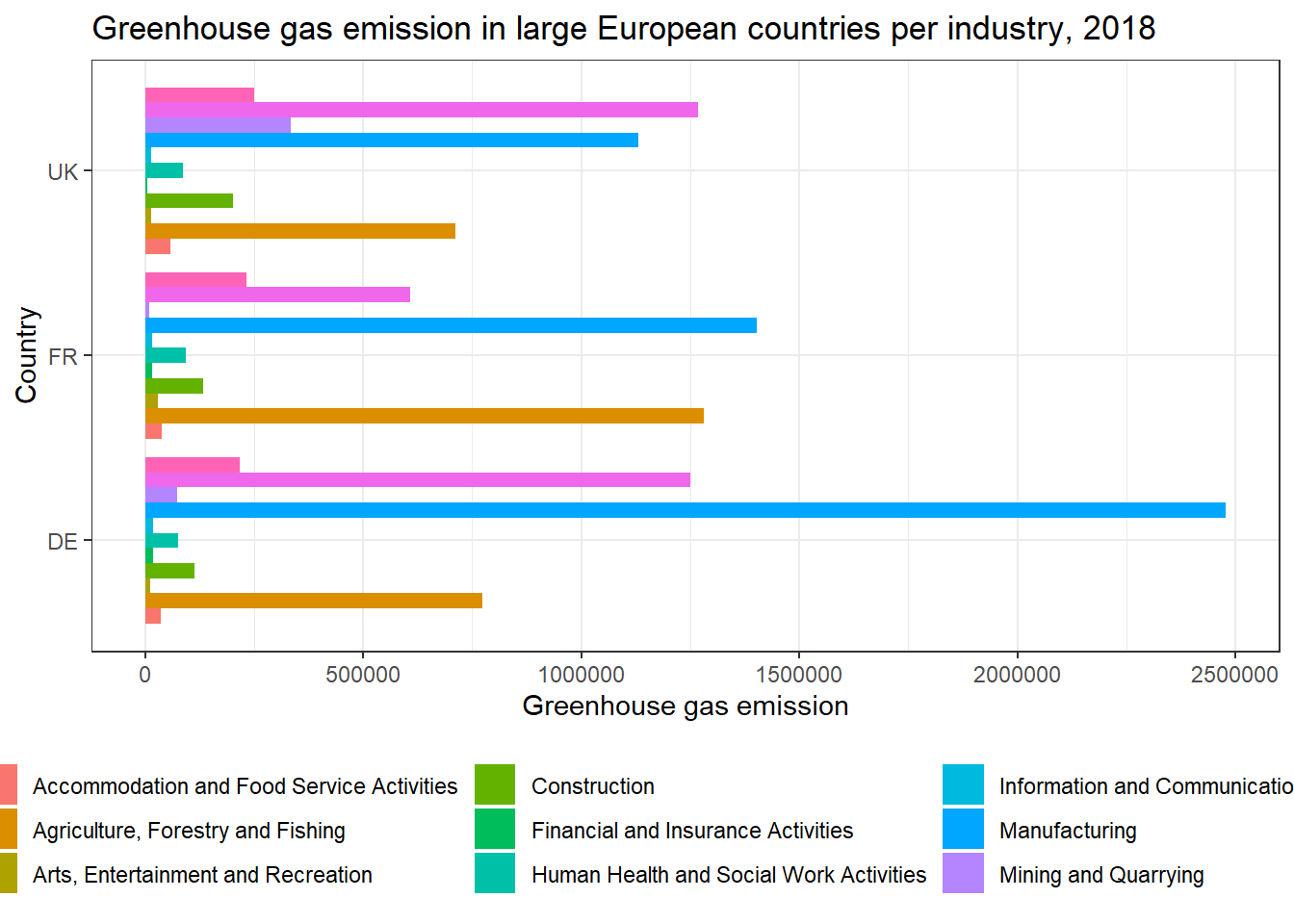
There are many ways to modify the legend. If you want to remove the legend altogether, you can give the legend.position function the argument "none".
green_research %>%
  filter(time == 2018) %>%
  filter(industry != "TOTAL") %>%
  filter(geo %in% c("DE", "FR", "UK")) %>%
  ggplot(aes(geo, GHG, fill = industry)) +
  geom_bar(stat = "identity", position = "dodge") +
  coord_flip() +
  labs(x = "Country",
       y = "Greenhouse gas emission") +
  ggtitle("Greenhouse gas emission in large European countries per industry, 2018") +
  theme_bw() +
  theme(legend.position = "none")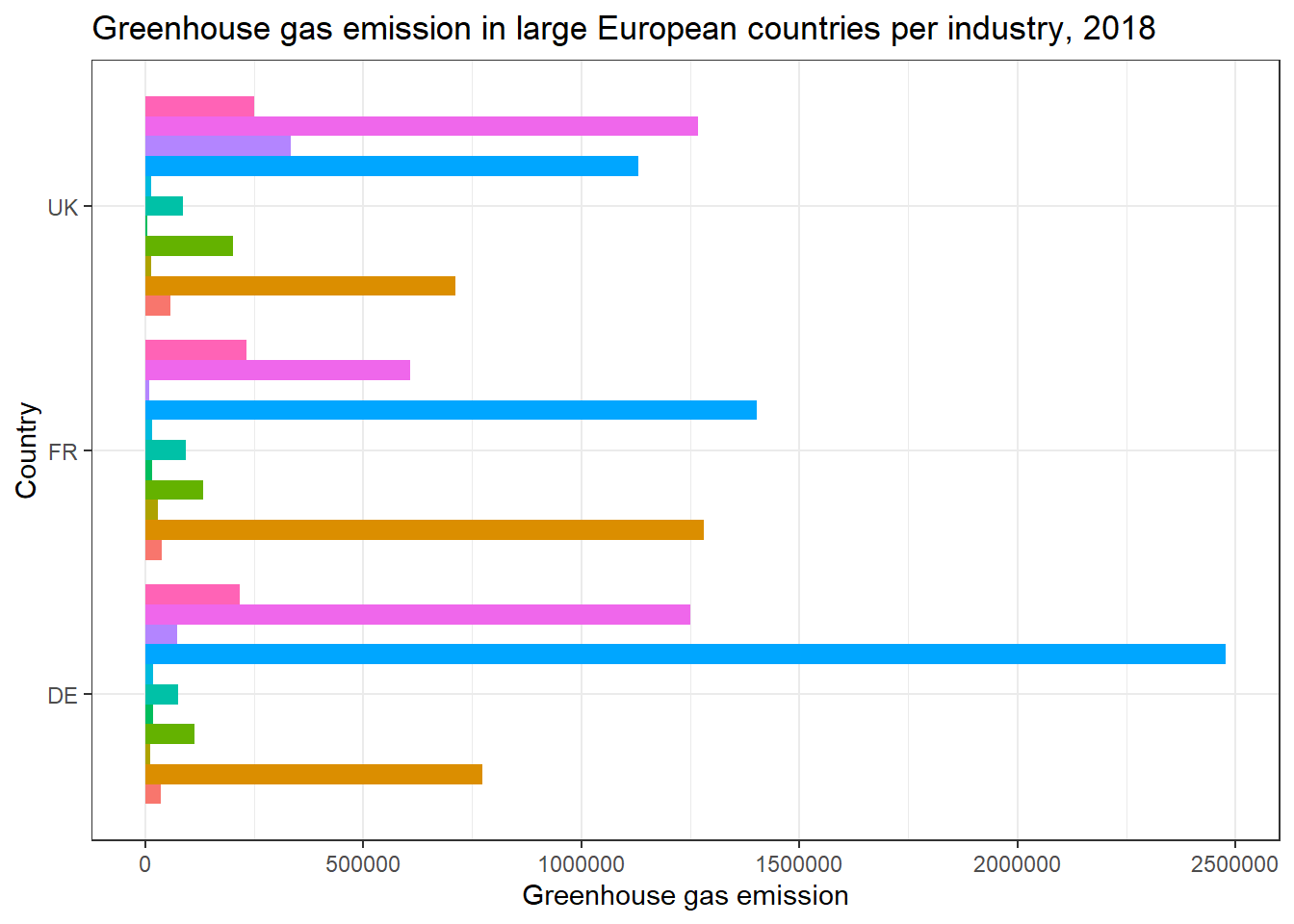
If you want to change the colors of the bar, this is done with the argument scale_, adding to this function depending on what you want to do. In the case below, I use scale_fill_manual because I’ve used the argument fill above to define categories in the plot, and manual because I want to choose the colors myself. Inside here, I define the colors with the argument values. The names of the colors are diverse, you can look at this page for more information.
green_research %>%
  filter(time == 2018) %>%
  filter(industry != "TOTAL") %>%
  filter(geo %in% c("DE", "FR", "UK")) %>%
  ggplot(aes(geo, GHG, fill = industry)) +
  geom_bar(stat = "identity", position = "dodge") +
  coord_flip() +
  labs(x = "Country",
       y = "Greenhouse gas emission") +
  ggtitle("Greenhouse gas emission in large European countries per industry, 2018") +
  theme_bw() +
  scale_fill_manual(values = c("blue", "red", "pink", "orange", "skyblue", "hotpink", # Changing colors of bars
                               "lawngreen", "honeydew", "goldenrod2", "coral3", "navy")) +
  theme(legend.position = "top")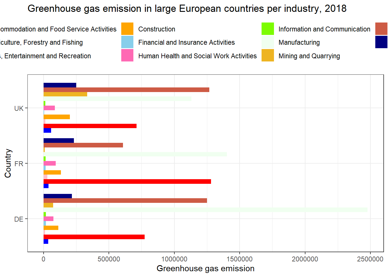
In the case above, I used scale_fill_manual because I used fill to define the categories. Had I used color to define the categories and wanted to pick my own colors, I’d use scale_color_manual. If my color variable had been continuous and I wanted to reflect this in the plot, I could use scale_color_continuous.
In the example below, I used color to define the categories. Also, I use brewer here to refer to a ready-made color palette. For different exisiting color palettes, consult the internet, for example this page.
green_research %>%
  mutate(time = as_factor(time)) %>%
  filter(geo %in% c("DE", "FR", "UK")) %>%
  filter(industry == "TOTAL") %>%
  ggplot(aes(time, GHG, group = geo, color = geo)) +
  geom_line(size = 1.5) +
  scale_color_brewer(palette = 2) + # Choosing color palette no. 2
  theme_dark() # Choosing theme_dark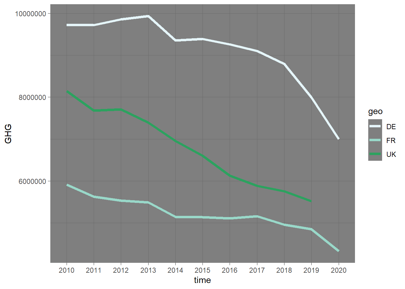
Coloring a plot can be quite tricky, but trying and error gets you there eventually. Personally, I use this page quite a lot when trying to color my plots.
Facets are also a rather common practice with plots. Once again, they allow us to divide plots by categories, hopefully making them more readable. What facets do, is that they create small plots for each category. To create a facet, use facet_wrap and and specify the name of the variable where you want one plot per unit. Here, I use the geo-variable. Also, remember to add the ~.
You can also use facet_grid. This puts the plots side by side, instead of in a square.
green_research %>%
  mutate(time = as_factor(time)) %>%
  filter(industry == "TOTAL") %>%
  ggplot(aes(time, GHG, group = geo, color = geo)) +
  geom_line(size = 0.8) +
  facet_wrap(~ geo) # Use "wrap" to get the plots stacked in a square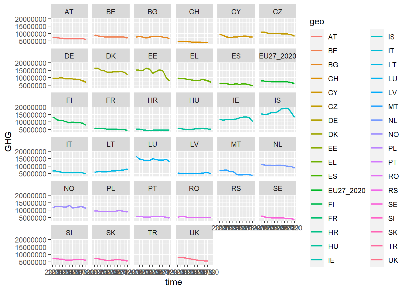
green_research %>%
  filter(geo %in% c("DE", "FR", "UK")) %>% # facet_grid works better for fewer categories, so I filter out just some countries
  mutate(time = as_factor(time)) %>%
  filter(industry == "TOTAL") %>%
  ggplot(aes(time, GHG, group = geo, color = geo)) +
  geom_line(size = 0.8) +
  facet_grid(~ geo) # Use "grid" to get the plots next to each other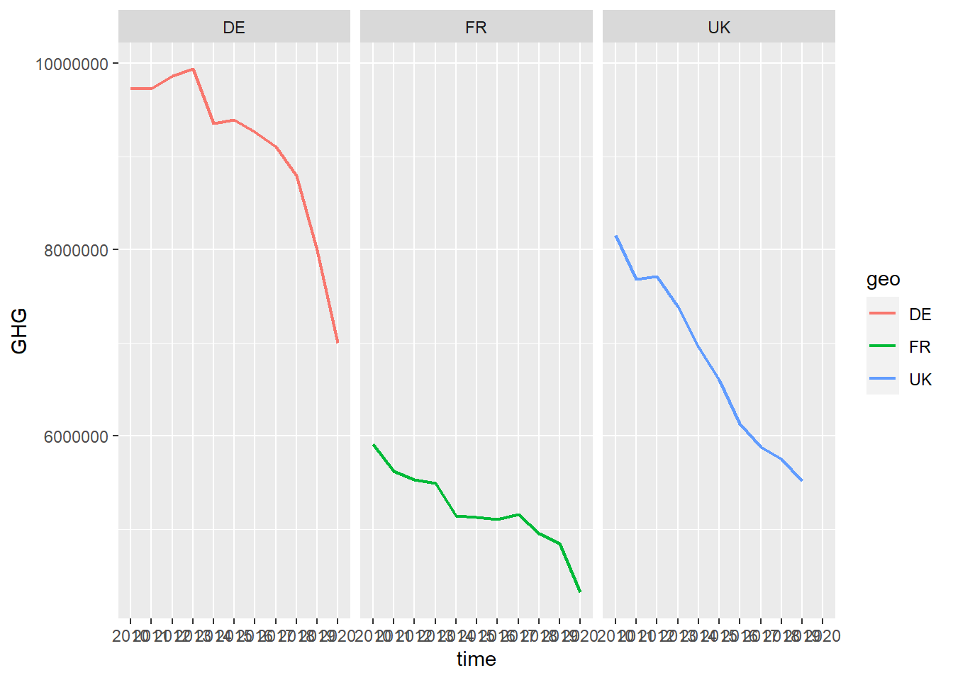
You can customize ggplot to become almost anything. We’ve been through a few methods for customization here, but once you get the hang of the technical aspects, the only limit is your creativity. Look things up on the internet regularly, and you will see how much you can do.
For example, in the plot above, we might notice that the names of the years are squeezed into each other. To change this, we can add the axis.text.x function to theme with the argument angle = 90 inside element_text() to tell ggplot that we want the text on the x-axis rotated 90 degrees.
green_research %>%
  filter(geo %in% c("DE", "FR", "UK")) %>%
  mutate(time = as_factor(time)) %>%
  filter(industry == "TOTAL") %>%
  ggplot(aes(time, GHG, group = geo, color = geo)) +
  geom_line(size = 0.8) +
  facet_grid(~ geo) +
  theme(axis.text.x = element_text(angle = 90)) # Turn the text on the x-axis 90 degrees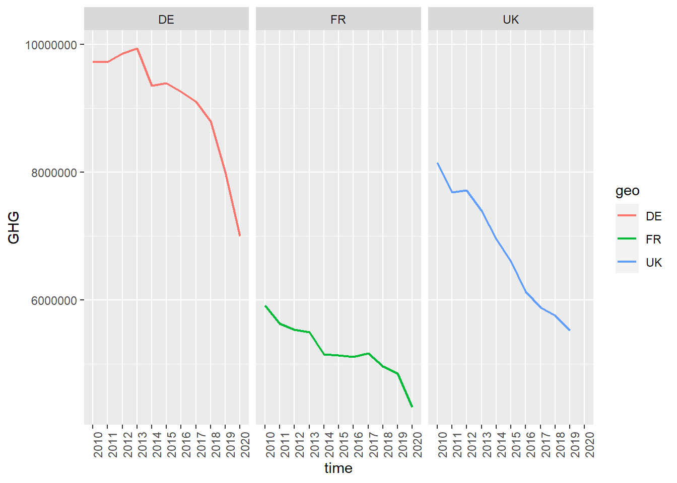
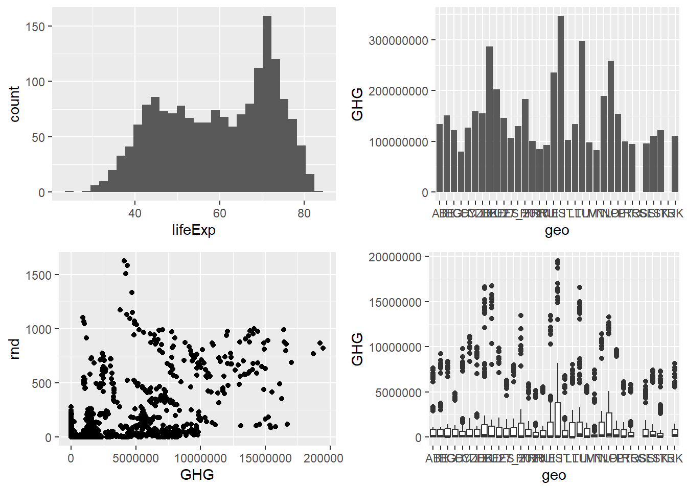
Should you want several plots side by side, one option is to use gridExtra. Another option is cowplot.
library(gridExtra)

plot1 <- gapminder::gapminder %>%
  ggplot(aes(lifeExp)) +
  geom_histogram()

plot2 <- green_research %>%
  ggplot(aes(geo, GHG)) +
  geom_bar(stat = "identity")

plot3 <- green_research %>%
  ggplot(aes(GHG, rnd)) +
  geom_point()

plot4 <- green_research %>%
  ggplot(aes(geo, GHG)) +
  geom_boxplot()

grid.arrange(plot1, plot2, plot3, plot4)