library(ggplot2)
library(plotly)

gapminder <- gapminder::gapminder

gapminder %>% # Which dataset are you using
  ggplot(aes(lifeExp)) + # Which variable(s) are you plotting
  geom_histogram() # Which type of plot are you making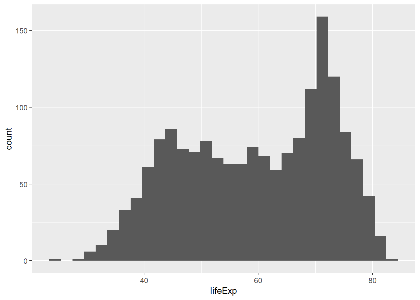
plotly is a framework to build visualizations. In R, it is simply a package we can download to make plots.
So maybe you’ve just got the hang of visualizing data with ggplot2. You’ve started creating some pretty awesome graphs and perhaps even started to get some preferences regarding background or colors. Moreover, because of the wide use and support, you can look up almost anything on the internet, and new features are being developed all the time. With all these benefits, why start learning another data visualization package at all?
In all due honesty, the packages are very similar in terms of speed, user friendliness and customization tools, but plotly has one advantage over ggplot. plotly can create interactive graphs. This makes the package great for website development, even if you’re just creating a simple dashboard. If you’re working in a team with others, plotly can also be handy because it’s simpler integrate with other programming languages such as Javascript and Python. For a good and comprehensive look at what plotly has to offer, have a look at their webpage.
plotlyLet’s compare the use of ggplot2 and plotly on making our simple histogram from the gapminder dataset. As you can see, the syntax is slightly different, but the main components remain. In both syntaxes, you have to specify (1) what your dataset is, (2) which variable(s) you are plotting and (3) what kind of plot you are making.
library(ggplot2)
library(plotly)
gapminder <- gapminder::gapminder
gapminder %>% # Which dataset are you using
ggplot(aes(lifeExp)) + # Which variable(s) are you plotting
geom_histogram() # Which type of plot are you making
gapminder %>% # Which dataset are you using
  plot_ly(x = ~lifeExp, # Which variable(s) are you plotting
          type = "histogram") # Which type of plot are you making
If you opened this in a browser, you’ll see that you can hover over the bars in the plot to see the data points beneath.
We’ll go through a few ways to do data visualization plotly. To do this, we’ll use the Varieties of Democracy dataset (V-Dem), which is a dataset that is quite famous among political scientists. It’s a huge dataset mapping regimes across the world. The dataset is available for download here, but you can also use their R-package to download the data. We’ll use the R-package here. The package is not yet available on CRAN – the official place for storing and dowloading R-packages, but we can get the package from Github. To do this, we need to install devtools first, then use install_github with the name of their repository.
install.packages("devtools")

devtools::install_github("vdeminstitute/vdemdata")
With this package in place, we can load the package to R using library. To access the documentation for the package, have a look at this link. I’ve used the function find_var to discover variables that might be interesting to plot, for example looking up the word “emergency”.
# devtools::install_github("vdeminstitute/vdemdata")

library(vdemdata)find_var("emergency")Once this is in order, I know which variables I want, and I extract these from the dataset using select. I use the function contains to get all the variables which have the given strings in their names. The reason is that the V-Dem dataset often has several variables for one indicator. Some of them are weighed, some of them pertain to different questions, some of them give us uncertainty estimates, and so on. If you ever want to use the V-Dem data yourself, it’s a good idea to familiarize yourself with the codebook.
I use glimpse to give a small overview of what the data looks like now.
vdem2 <- vdem %>%
  select(country_name, year, # Country and year are units in the dataset, so I definitely need them
         contains("v2casoe"), # Was a national state of emergency in place at any point this year?
         contains("v2regsupgroupssize"), # In total, how large is the percentage share of the domestic adult (18+) population that belongs to the political regime’s supporting groups?
         contains("v2elsuffrage"), # What percentage (%) of adult citizens (as defined by statute) has the legal right to vote in national elections?
         contains("v3cllabrig")) # Does labor enjoy the right to organize freely and bargain collectively?

glimpse(vdem2)
Rows: 27,555
Columns: 37
$ country_name <chr> "Mexico", "Mexico", "Mexico", "Mexico"…
$ year <dbl> 1789, 1790, 1791, 1792, 1793, 1794, 17…
$ v2casoe_0 <dbl> NA, NA, NA, NA, NA, NA, NA, NA, NA, NA…
$ v2casoe_1 <dbl> NA, NA, NA, NA, NA, NA, NA, NA, NA, NA…
$ v2casoe_2 <dbl> NA, NA, NA, NA, NA, NA, NA, NA, NA, NA…
$ v2casoe_3 <dbl> NA, NA, NA, NA, NA, NA, NA, NA, NA, NA…
$ v2casoe_4 <dbl> NA, NA, NA, NA, NA, NA, NA, NA, NA, NA…
$ v2casoe_5 <dbl> NA, NA, NA, NA, NA, NA, NA, NA, NA, NA…
$ v2casoe_6 <dbl> NA, NA, NA, NA, NA, NA, NA, NA, NA, NA…
$ v2casoe_nr <dbl> NA, NA, NA, NA, NA, NA, NA, NA, NA, NA…
$ v2regsupgroupssize <dbl> -2.764, -2.764, -2.764, -2.764, -2.764…
$ v2regsupgroupssize_codelow <dbl> -3.728, -3.728, -3.728, -3.728, -3.728…
$ v2regsupgroupssize_codehigh <dbl> -1.773, -1.773, -1.773, -1.773, -1.773…
$ v2regsupgroupssize_sd <dbl> 0.994, 0.994, 0.994, 0.994, 0.994, 0.9…
$ v2regsupgroupssize_osp <dbl> 0.254, 0.254, 0.254, 0.254, 0.254, 0.2…
$ v2regsupgroupssize_osp_codelow <dbl> 0, 0, 0, 0, 0, 0, 0, 0, 0, 0, 0, 0, 0,…
$ v2regsupgroupssize_osp_codehigh <dbl> 0.463, 0.463, 0.463, 0.463, 0.463, 0.4…
$ v2regsupgroupssize_osp_sd <dbl> 0.463, 0.463, 0.463, 0.463, 0.463, 0.4…
$ v2regsupgroupssize_ord <dbl> 0, 0, 0, 0, 0, 0, 0, 0, 0, 0, 0, 0, 0,…
$ v2regsupgroupssize_ord_codelow <dbl> 0, 0, 0, 0, 0, 0, 0, 0, 0, 0, 0, 0, 0,…
$ v2regsupgroupssize_ord_codehigh <dbl> 0, 0, 0, 0, 0, 0, 0, 0, 0, 0, 0, 0, 0,…
$ v2regsupgroupssize_mean <dbl> 2, 2, 2, 2, 2, 2, 2, 2, 2, 2, 2, 2, 2,…
$ v2regsupgroupssize_nr <dbl> 1, 1, 1, 1, 1, 1, 1, 1, 1, 1, 1, 1, 1,…
$ v2elsuffrage <dbl> 0, 0, 0, 0, 0, 0, 0, 0, 0, 0, 0, 0, 0,…
$ v3cllabrig <dbl> 0.208, 0.208, 0.208, 0.208, 0.208, 0.2…
$ v3cllabrig_codelow <dbl> -0.337, -0.337, -0.337, -0.337, -0.337…
$ v3cllabrig_codehigh <dbl> 0.822, 0.822, 0.822, 0.822, 0.822, 0.8…
$ v3cllabrig_sd <dbl> 0.624, 0.624, 0.624, 0.624, 0.624, 0.6…
$ v3cllabrig_osp <dbl> 1.05, 1.05, 1.05, 1.05, 1.05, 1.05, 1.…
$ v3cllabrig_osp_codelow <dbl> 0.694, 0.694, 0.694, 0.694, 0.694, 0.6…
$ v3cllabrig_osp_codehigh <dbl> 1.426, 1.426, 1.426, 1.426, 1.426, 1.4…
$ v3cllabrig_osp_sd <dbl> 0.379, 0.379, 0.379, 0.379, 0.379, 0.3…
$ v3cllabrig_ord <dbl> 1, 1, 1, 1, 1, 1, 1, 1, 1, 1, 1, 1, 1,…
$ v3cllabrig_ord_codelow <dbl> 1, 1, 1, 1, 1, 1, 1, 1, 1, 1, 1, 1, 1,…
$ v3cllabrig_ord_codehigh <dbl> 1, 1, 1, 1, 1, 1, 1, 1, 1, 1, 1, 1, 1,…
$ v3cllabrig_mean <dbl> 1, 1, 1, 1, 1, 1, 1, 1, 1, 1, 1, 1, 1,…
$ v3cllabrig_nr <dbl> 2, 2, 2, 2, 2, 2, 2, 2, 2, 2, 2, 2, 2,…To get bar plots with plotly, use type = "bar". In the plot below, I make a bar plot comparing the percentage of adult population with suffrage in some southern European countries for 1880, 1950 and 1980. Notice that to add customization such as titles on the axes and plot background color, I add another layer using the pipe and call the function layout.
 vdem2 %>%
  filter(country_name %in% c("Spain", "Portugal", "Italy", "Greece")) %>% # Picking the countries Spain, Portugal, Italy and Greece
  filter(year %in% c(1880, 1950, 1980)) %>% # Picking the years 1880, 1950 and 1980
  plot_ly(x = ~country_name, # Setting the country names to be on the x-axis
          y = ~v2elsuffrage, # Setting the percentage with suffrage on the y-axis
          group = ~year, # Grouping the bars by year
          color = ~factor(year), # Coloring the bars by year
          type = "bar") %>% # Telling R that we want a bar plot
  layout(xaxis = list(title = ""), # Adding name to the x-axis, an empty string "" gives no name
         yaxis = list(title = "Share of adult population with the right to vote"), # Adding name to y-axis
plot_bgcolor = "lightgrey") # Setting the background color of the plot to light greyTo make a scatterplot, add the argument type = "scatter" and mode = "markers". Here, I also do a re-coding of the v2casoe_1 variable to make it dichotomous, where values below 0.5 take the category “Emergency”. I use drop_na to rid myself of all the missing variables on the v2casoe_1 variable, since these would have been present in the plot, creating noise.
I set the variables for the x-axis, the y-axis, and for the colors of the dots. plotly also offers us another neat trick when creating interactive graphs, namely specifying what you want to display when the audience hovers over the information in the plots. In this case, it could be nice to give the audience information about which country and year the different plots refer to. We do this by adding text =, including here the values we want to show up, then adding hoverinfo = "text".
vdem2 %>%
  mutate(v2casoe_1 = ifelse(v2casoe_1 < 0.5, "Emergency", "Non-emergency")) %>% # Recoding the v2casoe_1 variable to become "Emergency" if the value is over 0.5 and "Non-emergency" if the value is below 0.5
  drop_na(v2casoe_1) %>% # Removing all missing variables from the v2casoe_1 variable
  plot_ly(x = ~v2elsuffrage, # Setting the percentage of the population with suffrage to x-axis
          y = ~v2regsupgroupssize_mean, # Percentage of population in regime main supporting group on y-axis
          color = ~v2casoe_1, # Setting the colors of the dots to whether there was an emergency
          colors = c("blue", "orange"), # Specifying colors to blue and orange
          text = ~paste(country_name, year), # Adding a variable used to hover over the dots, pasting together values from the country_name variable and year variable
          hoverinfo = "text", # Using this hoverinfo variable to display when hovering over dots
          type = "scatter", # Telling R that we want a scatterplot
          mode = "markers", # Telling R that we want dots, not lines
          alpha = 0.2) %>% # Adding some dot transparency
  layout(xaxis = list(title = "Share of adult population with the right to vote"),
yaxis = list(title = "Percentage of population in regime main supporting group"))To make a boxplot, simply specify type = "box".
vdem2 %>%
  mutate(v2casoe_1 = ifelse(v2casoe_1 < 0.5, "Emergency", "Non-emergency")) %>%
  plot_ly(x = ~v2casoe_1,
          y = ~v2regsupgroupssize_mean,
          type = "box") %>%
  layout(xaxis = list(title = ""),
yaxis = list(title = "Percentage of population in regime main supporting group"))Lineplots are made by specifying type = "scatter" and mode = "lines". In this case, I filter out Norway and look at this country over time. In this plot, I also show how to add an extra line. Adding variables to the plot can be done in several other ways in plotly using for example add_lines or add_trace. I give names to the lines, so that this is what will show up in the legend. Lastly, what is new in this plot is that I specify the exact coordinates of the legend and whether I want the categories to show vertically or horizontally.
vdem2 %>%
  filter(country_name == "Norway") %>%
  plot_ly(x = ~year,
          y = ~v2regsupgroupssize_mean,
          name = "Percentage of population in regime main supporting group", # Giving name to the line being plotted
          type = "scatter",
          mode = "lines") %>% # Specifying that we want lines
  add_lines(y = ~v2elsuffrage, # Add an extra line to the plot, plotting the variable v2elsuffrage as well
            name = "Percentage of adult population with the right to vote", # Giving name to the second line being plotted
            mode = 'lines') %>% # Specifying that this should be lines, not markers (dots)
  layout(xaxis = list(title = ""),
         yaxis = list(title = ""),
         legend = list(orientation = "v", # Wanting the legend to list the categories vertically ("v")
x = 0, y = 1.1)) # Placing the legend at these coordinates in the plot (play around to find the right customization)ggplot to plotlyThere is a function to go from a ggplot2 plot to a plotly plot, and it’s called ggplotly. Doing that makes you ggplots interactive.
plot <- vdem2 %>%
  filter(country_name %in% c("Spain", "Portugal", "Italy", "Greece")) %>%
  filter(year %in% c(1880, 1950, 1980)) %>%
  ggplot(aes(x = country_name,
             y = v2elsuffrage,
             fill = factor(year))) +
  geom_bar(stat = "identity", position = "dodge") +
  labs(x = "",
       y = "Share of adult population with the right to vote")

ggplotly(plot)